Blog
CATEGORY: Best practice
A picture paints a thousand words, but that's just half the story - Effective use of imagery in email
An issue that is hotly debated by our team of email geeks is the role of imagery within email and, more importantly, how critical (or not) that role is.
As email obsessives, the conflict between communication, design and visual hierarchy vs the complexities of rendering and the idiosyncrasies of the various email clients are a source of almost daily discussion.
In particular, for those of us working in the B2B sphere where some of the most prevalent email clients use 'images turned off' by default - is adding imagery really worth the effort?…
Of course, the answer to this question, as with so many, is actually “it depends” – so I have undertaken to put as much information as possible in this article to help you decide what is right for your audience – and hopefully a few ideas that you can test out – so your use and choice of imagery is an informed one.
So let’s start, where all good marketers do – with some stats
The 2020 email marketing stats round-up by Snov.io showed that:
emails that include some kind of imagery have a 4.5% higher CTR than text-based emails;
two-thirds of people claim they prefer receiving emails consisting mostly of images;
best-performing emails have the text to image ratio at 60:40.
So why are images generally so effective?
Images are easier for us to process
According to research, our brain is wired for visual content – images transmit information 60,000 times faster than conventional text would. This happens because visuals are the natural stimuli for our brain to start processing the information.
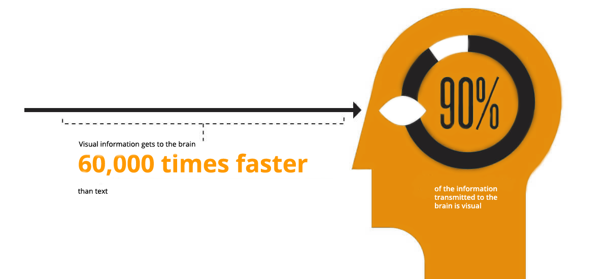
Human eyes can
register a stunning 36,000
visual messages per hour. Think about reading 36,000 words per hour. That is a pretty
big challenge for the average reader, who consumes about 250 words per minute on average (depending on
your source), totalling 15,000 words per hour. Bottom line: visuals communicate
more information, much faster.
It works the same way in email marketing. A photo or any other visual in an email helps us process information in it faster and determine its value easier.
Images are more memorable
Not only do visuals communicate more information more quickly – you are also more likely to retain the information that you take in from a visual stimulus. Studies show that people remember:
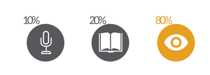
10% of what they hear — — 20% of what they read — — 80% of what they see.
This is because the human brain processes visual cues better than the written language. Most of us process information based on what we see. According to the Social Science Research Network, 65% of us are visual learners and, although this study was published back in 2013, it is yet to be refuted.
There is also the so-called multimedia principle, which posits that “people learn more deeply from words and graphics than from words alone,” which has become among the most well-established educational principles, and has been applied widely in educational spheres.
What does this mean for email?
Well-matched images complement the text and help deliver its message.
An image should not duplicate the text but should help to set the mood or to literally show the message’s subject.
Since there is little time available for an email to catch a user’s interest, any opportunity to convey meaning with an image or icon is incredibly useful. If you want to tell your subscribers about a new feature, take some quality screenshots or, better still, create a GIF that will display the action.
Each image in an email is used not only to convey the key message of the email but also to strengthen your brand and communication style. Determine your visual style and topics and choose all images in this framework. Your emails help reinforce your brand’s visual identity just as much as it promotes recognition from your subscribers.
HubSpot’s 2020 research concluded that over 20% of surveyed marketers stated that proper brand-oriented email design significantly helps improve their email engagement.
However, there is no need to add an image just for the sake of it. If a user opens the email only to confirm their registration, show them the link and don’t distract with excess content.
There is also no point to including an image that does not contribute to communicating the email’s message.
So whether you use an image or not really does depend, both on the message or function of the email and if there is a suitably message enhancing image available.
Roles of imagery in email
Images can perform different roles within the email – here are the key ones;
Hero images
A Hero image is the first visual that your subscribers see, giving them a glimpse of what your email is about. It helps to grab the subscribers' attention and direct them towards a desired call to action.
Hero images often have a text element to them as well, but you must be mindful of those recipients who have images switched off by default – so as pivotal as your Hero image is, your email must still be able to stand and communicate without it.
Icons, emoji and infographics
Similar to the Hero image, icons and infographics both reinforce your brand and enhance your message. They can make it easier for the reader to process the information that you are providing. 40% of people respond to visual information better than plain text.
Inboxes are crowded places with limited real estate and emoji are an easy and expressive way to stand out to subscribers. Even as a fully accepted part of modern language (don’t believe me - read Are you using the right emoji?) emoji remain a good way to standout in the inbox as their use in email is not commonplace. But be wary, some emoji do not render in all clients and can be interpreted differently depending on context or culture.
If you would like more information on using emoji in your subject lines, have a look at our dedicated article.
Background images
Many brands default on embedding text in images because they want to place copy in front of an image. You can actually make that happen and keep your emails accessible by using live text and background images.
Instead of being a main focal point of the email, like a hero image, background images are more often subtle and complementary to the other content in the campaign.
Unlike other images, where only the image itself can exist in that space, background images provide layering possibilities, so that you can have additional images, text, or calls-to-action existing within that same space. This means that you would be able to put live text on top of your background images, providing more design flexibility while keeping the content accessible. This also means that if your subscribers have images disabled, the text is still visible.
On the one hand, using background images can help your email stand out from other emails, it gives more email design opportunities. On the other hand, not all email clients display these backgrounds equally. So for some recipients, your email will be viewed differently than you intended.
Whilst this list is handy, it is also worth remembering that the environment where the client is being used as there are also differences between Mac and Windows environments. To understand how your email will appear in the most popular clients and the clients that are most used by your audience, use e-shot’s Forensics tool to see first-hand how your message will render.
Don’t forget the Alt text
In case your audience has trouble loading the full version of your email and in order to comply with the Email accessibility rules, you need to include alt text that will appear in the plain text version, or in case users blocked images or are relying on screen readers or other assistive technology.
When writing alt text for your email images, make sure that;
the alt text is concise;
keywords are included;
you don’t mention the word ‘image’. The format of the imagery is enough to determine the type of content you’re describing in the alt text.
Setting alt text for images in an HTML email is simple, but you can also get fancy with it, adding a bit of inline CSS to change the font, colour, size, style and weight. However, much like background images, support is mixed across email clients. It’s important regardless to include alt text, but consider places where styled alt text might work well.
So now I have explained why images are so fantastic, I have to make sure you can see why they are only half the story.
6 reasons you should NEVER send emails that are all images
If your recipient has images turned off, they will not understand your message - and it is not just the usual suspects that B2B marketers frequently consider for their marketing campaigns ie Outlook. Litmus found that 43% of Gmail users view emails with images off when they conducted their research.
The size of the email can cause it to load slowly or not load at all - the longer images take to load, the more likely your subscriber will be disengaged and delete your email—and if images are all your email has to offer, this can affect future engagement with your brand. In this world of instant access, people are no longer prepared to wait for content to load – no matter how valuable that content might be.
Not including live text can hurt your email’s accessibility - If there is no text available in your email, screen readers and other accessibility tools will not be able to understand the content you are promoting. Another interesting consideration is that unlike screen readers, voice assistants (like Siri or Alexa) do not seem to recognize ALT text and other HTML attributes, so even if you have set ALT text for your image-only email, it won’t matter for this subset of your audience: the email will be completely blank to them.
Mobile devices resize images to fit smaller screens, which can result in tiny, unreadable text.
Your emails won’t be searchable - similar to the comment above, as search technology within email clients is not able to identify text within images, it will not be able to “read” your message and put it forward for potentially relevant search criteria. So if subscribers remember something helpful or valuable in your emails that they need to find again at a later date, if you placed all of your text in your images, your content is no longer searchable, leaving you and your subscriber disappointed.
Affect deliverability - image heavy emails without much text can raise a red flag for spam filters. This theory was formulated because spammers sometimes display information in large images instead of text so that the filter programs cannot 'read' the content. Email clients often block image-only emails as a first line of defence against spam. The second line of defence is to route image-only emails directly to the junk or spam folder.
Bonus tip – Make sure your buttons are bullet-proof
As marketers, we all understand the importance of getting people to interact with our campaigns. That’s why the call-to-action, or CTA, is critical. Because of image blocking, it’s important to never make your CTAs images, as they could easily be hidden and completely missed by your subscribers. Bulletproof buttons allow you to build buttons with code instead of images. You can reliably swap your GIFs, PNGs, and JPEGs for HTML and CSS. By only using HTML and CSS, the button will display in all email clients even with images off, hence making them “bulletproof.” (Don’t worry, if you use the e-shot drag and drop editor, then the buttons are bullet-proof by default).
Bonus tip II – Image to text ratio
There’s no “perfect” ratio to aim for, but most marketers try to keep images between around 20% and 50% of the content. Going above 50% can trigger spam filters and prevent your messages from reaching inboxes. On the other hand, including more than 80% text will make your email unnecessarily difficult to read. Don’t be afraid to experiment with different ratios to see what leads to the best results.
And finally, the practical bit...
The format of the image
There are three main formats that you can use to save email images – JPEG, GIF, and PNG. In our article “Which is the best image format for email?” we talk about this in more detail, but here is a quick overview.
JPEG images – you can use this format if you want your imagery to retain colour, but you should keep in mind that JPEG format will shrink your image, reducing its quality significantly;
GIF images – the main benefit of this format is the ability to include animation in your email, however you need to remember that support for this is not consistent across all email clients. The significant drawback of GIF format is that it doesn’t show colours as vividly as the JPEG format would;
PNG images – if you need to effectively place an image with sharp edges, include a logo or a visual with a transparent background, this format should be your first choice. The PNG format also retains the quality of an image regardless of its size and colour saturation.
Keep in mind that if you include heavy PNG images, it will also increase the size of your email, affecting its loading time.
If you would like a bit more information on the effective use of GIF files in email take a look at our article "What is a GIF and why should you care?"
Colour profile
The colour profile of email images differs from those that are used for print.
When working on imagery for your marketing emails, make sure that you save them with the RGB colour mode. As opposed to the CMYK colour profile used for printed images, RGB colour mode uses red, green and blue to create a wide diversity of colours to show them correctly on screen displays, but doesn’t work for print.
File size
As we already mentioned, including heavy images in your emails can negatively impact their loading time or distort the way the image appears on the screen.
On average, we recommend including email images that have the maximum size of 1MB and 72 DPI. This file size is enough to appear correctly in the digital format and won’t distort the quality of your overall email design.
Image sizes
Of course, the size of your email images will also depend on the design and format, the number of background images in email, and the number of columns. For instance:


Keep in mind what content you include in each block and indents between blocks of your email template because it will also impact the size of the imagery. For more information on image requirements for our drag and drop editor take a look at our dedicated help article.
Retina images
Retina are basically double-density images: a 200x200 pixel image squeezed code-wise into a 100x100 pixel space is retina. On phones and Mac retina displays, this makes the image look super-sharp.
How do you handle images in e-shot™?
With the image editor in the e-shot™ design manager, you can easily edit your images within the platform itself. Adjust size, add special effects and more. Take a look in our design manager and see what you can do.
A few things to remember:
e-shot’s image manager limits file sizes to 1MB.
To keep images high resolution we recommend that you upload them in the same dimension measurements as the block measurements.
Some email clients will crop your image if you go above a certain height. We recommend keeping the height below 1000 pixels to prevent this.
Ensure that spaces and special characters are removed from your file names before uploading to the image manager. This can prevent your images from displaying correctly when you try to place them in your designs
PS If you don’t know where to start looking for images Snappa have compiled a list of 21 Amazing Websites with breath taking free stock photos
Solutions
Email marketing healthcheck
We are confident that we can help you, which is why we offer a free healthcheck to identify potential issues with your current programme and free advice on things that could be done to improve it.

