Blog
CATEGORY: DesignBest practice
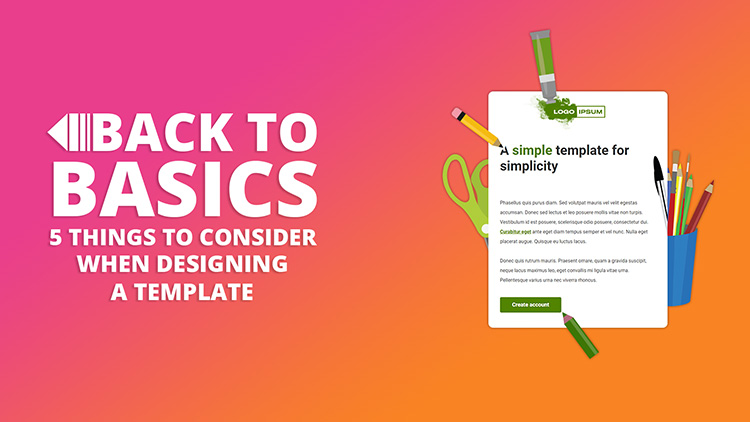
Back to Basics: Top 5 things to consider when designing a template
It can be quite overwhelming staring at a blank screen knowing that what you create will be the basis for a series of coms or even the backbone of all your branded coms - so whether you are creating a template yourself or commissioning a designer to do it for you - here are our top 5 things to consider when creating a template.
(Alternatively take a look at our library of best practice templates or brief our experts to create one for you)
Here are our top 5
Layout
I have already mentioned structured, logical order – depending on the email purpose follow the “F in email” or inverted pyramid to position key messages. Once you have your key elements in place try the “squint test” (see below) and see what your take away from your message.
CTAs
Clear, bold motivating and in a logical place – does your CTA need some explanation to boost motivation or is the headline enough to drive interest. Answer the reader’s question “what’s in it for me?” and be imaginative, there is no excuse for “Read more”
Responsiveness
Again simplicity is key, so there are no stacking surprises when your design is viewed on a smaller screen. Design “mobile first” as designs translate better to increased size than reduced – and ensure your CTAs are big enough to select on a mobile screen.
Accessibility
Keep it structured, simple and concise. Use the tools available to make your message logical and clear. Use headings (tagged as headings), simple language, meaningful alt text and lists where relevant.
Dark mode
Be mindful of your choice of colour, both for accessibility and dark mode – make sure there is a suitable contrast and for icons/logos use .png with transparent backgrounds. But test you design thoroughly as different email clients handle colour in different ways – only way to be sure is to test.

The Squint Test is quite literal – display your design on screen, take a step back and squint your eyes (close them partially to distort your vision). The design should become blurry and only the largest, most basic shapes of the interface should be able to be perceived. It is still clear the message that you are trying to get across?
You may also like these blogs
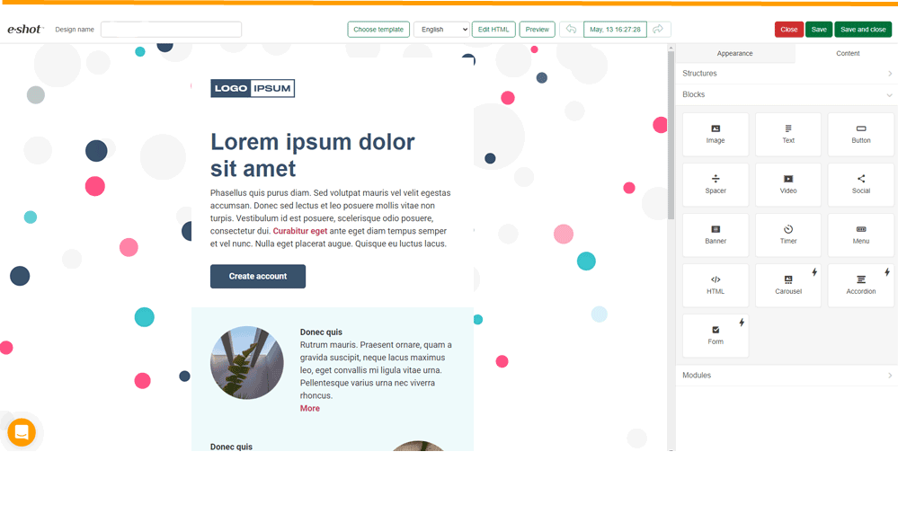
Template showcase: Background image template
June 8th, 2021 - Sadie Burgess
In this edition of our template showcase we are looking at design that used a background image and some interesting design features to add interest...
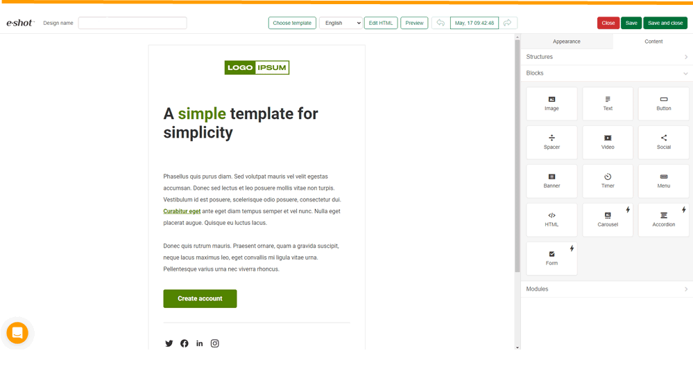
Template showcase: Basic template
June 8th, 2021 - Sadie Burgess
In this edition of our template showcase we are looking at our simplest design. But don't let the fact that the design is simple deceive you...
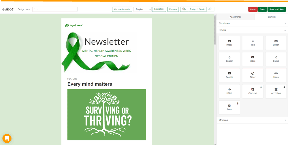
Template showcase: Newsletter template 1
June 8th, 2021 - Sadie Burgess
In this edition of our template showcase we are looking at a newsletter design template that uses a restricted colour palette and a variety of...
Solutions
Email Marketing
Create email campaigns and newsletters and manage end-to-end subscription processes with forms and preferences.
Marketing Automation
Create sophisticated automated campaigns for email and SMS combined.
Digital Communication
The comprehensive solution to manage and automate your digital communication across email, SMS, websites and landing pages.
Email marketing healthcheck
We are confident that we can help you, which is why we offer a free healthcheck to identify potential issues with your current programme and free advice on things that could be done to improve it.