Blog
CATEGORY: Best practice
Making accessibility accessible

From 23 September 2020, all public sector organisations have a legal duty to make sure websites meet accessibility requirements.
The Minister for Implementation, Simon Hart said:
“Although directly impacting the public sector, the regulations provide a necessary reminder for all organisations to consider the needs of all users when building online services.”
Although the guidance does not make explicit reference to email communications as a fundamental communication channel, frequently used in parallel with online it would be remiss not to consider the accessibility of your emails at the same time as reviewing the rest of your communication suite. However, whilst acknowledgement of the importance of accessibility is now becoming more mainstream, many marketers still would not know where to start making their email communications accessible.
Why is accessibility important?
In short, there are a lot of people within this potential audience. According to the World Health Organization, 2.2 billion people worldwide live with some form of visual impairment, with approximately 39 million people worldwide who are blind. In the UK specifically, around one in 30 people live with sight loss (~2million people).
Additionally, many people are colour blind. The most common form of colour blindness (red-green, also known as protanopia) occurs in ~1 out of every 12 males and ~1 out of every 200 females. People who experience this do not see a complete lack of colour where reds and greens appear, but instead, they have a harder time distinguishing the two colours from each other as the reds will look like greens. But there are many forms of colour blindness, indeed 99% of colour blind people can see some colour – complete colour blindness (also known as monochromacy) is actually quite rare. However, when you consider that in Britain there are approximately 3 million colour blind people (which equates to about 4.5% of the entire population), you realise the likelihood that someone in your contact database is affected.
This highlights the importance of ensuring you choose colours not only
for aesthetic and communication reasons, but for accessibility reasons, too. These visual differences are significant,
especially when you think how often colour is used to convey meaning or actions
online.
Yet,
“As email developers we spend hours getting an email to look just right in a client with less than 1% market share but very few of us will spend a few minutes making the email accessible”.– Renowned email developer and accessibility advocate Mark Robbins.
So what should we do?
It is worth spending some time becoming familiar with the wealth of information that is now available. There are also specific guidelines to help you understand what is required to ensure your communications and digital marketing are inclusive.
The Web Content Accessibility Guidelines (WCAG) 2.1 define how to make web content more accessible to people with disabilities. Accessibility involves a wide range of disabilities, including visual, auditory, physical, speech, cognitive, language, learning and neurological disabilities. The range and scope of WCAG is much broader than purely email communications and visual impairment. But it is a key reference to understand the needs of the ever growing audience with accessibility requirements. The W3 quick reference guide is a great resource to refer to.
Accessibility isn’t just about technology
There are many forms of assistive technology available to help those who have been affected by sight loss. They help visually impaired and disabled people use computers, tablets and smartphones, examples include screen readers and magnifiers, and even the more advanced eye-tracking technology. Because these tools exist, many visually impaired and disabled people can better access the internet and email and it is part of their communication landscape.
However, aside from these specific technologies, email developers and marketers can further assist these users by making emails more accessible with a few code and design adjustments. By using our Accessibility checklist, you can easily review your email for these important, but basic, accessibility elements and adjust your code instantly to make your email more accessible.
Let’s have a look at some of the key aspects in a bit more detail.
To meet basic accessibility requirements, an email must have:
A concise and descriptive subject line
A logical reading order
Use heading elements in code
Sufficient contrast between text and background colours
Meaningful Alt text for images
Meaningful link text
Thoughtful use of font, structure and layout
Concise, descriptive subject line
Just as for every other email recipient, the subject line is the first text people read, or have read to them by a screen reader. It should be meaningful, descriptive, concise and shouldn’t repeat the sender name. More so than many of us, people with vision impairments rely on subject lines to determine whether an email message is relevant to their needs as their investment in ‘reading’ the email is so much greater.
A logical reading order
HTML email newsletters and templates are commonly coded using tables, as these are the most reliable way to create layouts that work across desktop, webmail and mobile email clients.
If not planned and built thoughtfully though, people who rely on keyboard-only access might not receive the content in the order intended. Screen readers, for example, read aloud tabular content from left-to-right and from top-to-bottom.
This requirement
is particularly important to keep in mind when creating responsive email layouts, especially where images and
content are repositioned to allow for a comfortable reading experience on
mobile devices.
Maintaining a single-column layout
on all screens, regardless of size, reduces the likelihood of content being
read incorrectly.
Incorrect readings can happen when text is parsed and read aloud by screen readers in an incorrect order or in a way in which the context of the content is unclear. However, when using multiple column layouts, you can change the order in which content columns are stacked by using the <align> or <dir> HTML attributes.
Use heading elements in code
HTML heading elements, like <h1>, <h2> etc – are critical to ensuring hierarchy is conveyed to screen reader users, who may not be able to see them. Remember though that <h1> comes with a caveat for proper accessibility: it must only be used once per document. <h2>, <h3> etc can be used as many times as is meaningfully fitting within the document.
Keep in mind that simply styling text to stand out, or look more important is not sufficient when creating a content hierarchy for assistive devices.
Sufficient contrast between text and background colours
People with moderately low-vision or colour differences can be less sensitive to luminosity or colour contrasts when viewing text and images in an email message.
Therefore, it’s important to incorporate sufficient contrast between text and the background of an email message. You can use tools like https://contrast-ratio.com/to visually demonstrate how readable the colour combination is and it gives a grading in line with the contrast ratio requirements of WCAG 2.0*.
Apps like 'Color Oracle’ can be used to simulate a variety of colour deficiencies and ensure you are providing enough contrast – not to mention, non-colour based cues – for all email recipients to understand your email messages.
Meaningful alt text for images
All informative images must have an appropriate “alt text” that conveys the meaning or purpose of the image. Purely decorative images should carry an empty or null alt attribute (alt=””). This will inform screen readers that the image is decorative and should be ignored.
For example, a company logo is an informative image and should feature a text alternative. In HTML email code, this can be done using the alt HTML attribute, to convey its meaning to screen reader users:
<img src=”https://www.e-shot.net/assets/uploads/logo.png” alt=”e-shot: Email marketing made simple” />
In our Drag & Drop design tool, whenever you upload an image, you have the opportunity to include Alt text:
Meaningful link text
It’s important
to convey the purpose of links through the link text. This text informs the
reader what will display when the link is clicked and are also often used for
document navigation by screen reading devices.
Generic text, for example “click here” or “read more” should be avoided at all costs, as these will offer little meaning, especially when read out of context by a screen reader. Instead, we would recommend links in code like:
<a href=”http://.../link-recommendations.html”>read our recommendations for better link text<a>.
Thoughtful use of font, structure and layout
When you are creating your design, as a basis ensure that all text is 14pt or larger and try to select fonts that are particularly thin or compacted. Keeping your writing punchy and to the point is always a good idea in email content, but this is even more important in terms of accessibility. Your choice of language is also important, by using language and sentence structure that is easily digestible you can clearly and concisely get your message across.
If you have a list of separate linked items, one underneath the other, it's very important for accessibility to make them a bulleted list, and it should be a proper bulleted list, too, using markup such as
<ul>
<li><a href="#1">Item 1</a></li>
<li><a href="#2">Item 2</a></li>
</ul>
Finally remember, that if you have text within an image this will not be detected by screen readers, although this is best practice in email generally as many email clients have images off by default so your email must be just as impactful when the images are not visible.
It isn’t as hard as you might think to be inclusive
Accessibility could be seen as another complication in the already, sometimes daunting world of email marketing, where we routinely have to compensate for a variety of email clients who render designs in different ways and consider how our content may affect our deliverability.
But all it takes are a few small and relatively easy tweaks and the 5 million people in the UK that content with sight-loss or colour blindness will also have a positive experience of your messages when they hit their inboxes.
Tailored advice
If you want help with making a specific campaign accessible or would tailored advice based on one of your communications, we offer a free email healthcheck service. Simply send the email you would like reviewed to healthcheck@e-shot.net and visit our healthcheck page so we can contact you with our report.
As part of our healthcheck we look at a range of aspects from design and deliverability to content and of-course accessibility. So if you would like recommendations specifically for your next campaign we would love to help.
*NB If you make code changes and adaptions to your messages – don’t forget to test and preview your email. Even the slightest tweak to code can affect how your email renders.
PS A useful tool
If you visit http://www.accessible-email.org/you are able to either paste in and then improve your HTML code with accessibility in mind or generate a report analysing a sent campaign by simply pasting the URL to the online version into the analyser.
One of the founders Jordie Van Rijn commented:
“Accessibility is a part of communication. Nobody
thinks twice about sending an email in the right language, and checking if the
links work. Accessibility is the same thing. You want all your subscribers to
be able to receive, understand
and act on your emails.
That is working towards
email marketing goals.
Many accessibility improvements can be baked right in when creating your email
templates. It should be part of the design and coding process. “
It is the mission of Accessible-email.org to promote email marketing accessibility and usability. It is to be the voice of users and the email marketing community, and the two free tools that it offers support that commitment.
You may also like these blogs
Accessibility Design Resources
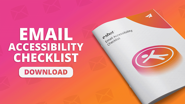
Email accessibility checklist
May 16th, 2024 - Sadie Burgess
According to the World Health Organization, 2.2 billion people worldwide live with some form of visual impairment, with approximately 39 million...
Public Sector Best practice Accessibility
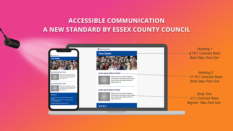
Accessible Communication: A new standard set by Essex County Council
November 25th, 2021 - Sadie Burgess
This week we were lucky enough to attend the Public Service Communications Academy event.The Public Service Communications Academy (Academy) is a...
Solutions
Email Marketing
Create email campaigns and newsletters and manage end-to-end subscription processes with forms and preferences.
Marketing Automation
Create sophisticated automated campaigns for email and SMS combined.
Digital Communication
The comprehensive solution to manage and automate your digital communication across email, SMS, websites and landing pages.
Email marketing healthcheck
We are confident that we can help you, which is why we offer a free healthcheck to identify potential issues with your current programme and free advice on things that could be done to improve it.