Blog
CATEGORY: Template showcaseAccessibility
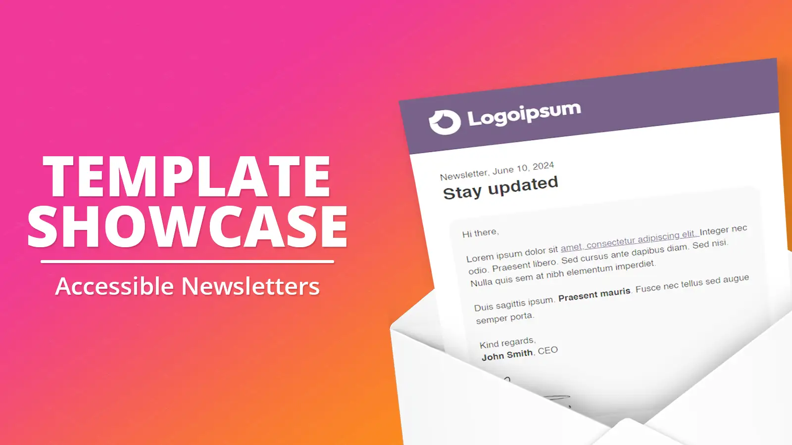
Template Showcase: Accessible Newsletters
Thursday 18 May 2023 is the 12th Global Accessibility Awareness Day (GAAD). The purpose of GAAD is to get everyone talking, thinking and learning about digital access and inclusion, and the more than one billion people with disabilities/impairments worldwide.
Our design team are always working hard to come up with new, engaging and useful templates, be it functional, seasonal or special interest. Each template has been thoroughly tested for accessibility, responsiveness and dark mode support, so we have put in the hard yards for you.
Accessible newsletters
Creating an accessible email campaign does not require complex coding techniques. By using simple, well-established principles and basic HTML, organisations can create email campaigns that can be accessed from a variety of devices and assistive technologies. Simple changes, such as using alt tags for images, adding descriptive text to links, and using semantic HTML, can make a big difference in creating an accessible email campaign.
We have created these five, single column structure, accessible newsletter templates to give you some inspiration:
Key principles - P O U R
Web Content Accessibility Guidelines, was born in 1999, which declared that emails need to maintain a logical order, use headings, have sufficient color contrast between text and backgrounds, provide alt text for images, include meaningful link text, and use a descriptive subject line in all cases.
Besides these base values WCAG includes the 4 below principles that you need to understand if you want to improve email accessibility across your organisation.
It is important to remember that the underlying spirit of P.O.U.R. isn't about rigidly adhering to hard and fast rules - it's about understanding and meeting the diverse needs of your audience.
Perceivable
This means the users must be able to perceive the information being presented, it cannot be invisible to all their senses. For example, ensuring that there is alt text available for images, and that any embedded videos have subtitles.
Alt text: Inconsistent use of alt text, or misunderstanding of what is required, is one of the most common problems we find when reviewing our customers’ emails. So we have created a dedicated article including 5 golden rules make your alt tags more useful to your email recipients.
TOP TIP: Choosing appropriate text alternatives:
Imagine that you’re reading the web page aloud over the phone to someone who needs to understand the page. This should help you decide what (if any) information or function the images have. If they appear to have no informative value and aren’t links or buttons, it’s probably safe to treat them as decorative.
Distinguishable content: Examples of making content distinguishable include:
Colour is not used as the only way of conveying information or identifying content
Default foreground and background colour combinations provide sufficient contrast
When users resize text up to 200% or change text spacing, no information is lost
Text reflows in small windows (“viewports”) and when users make the text larger
Images of text are resizable, replaced with actual text, or avoided where possible
Users can pause, stop, or adjust the volume of audio that is played on embedded video
Operable
Operable means that people need to be able to interact with their emails in alternative ways. In order to do so you need to make your emails:
Easy to navigate with the keyboard (tabs)
Use descriptive links to help people understand what a certain link does
Display elements for sufficient time, especially when have animated GIFs
Avoid using visuals that can cause seizures or other unwanted physical reactions
Understandable
Users must be able to understand the information as well as operation of the user interface.
Logical, navigable structure: the importance of good coding structure to allow users to change the presentation of content. Good structures also support effective navigation. For example, screen reader users often navigate through headings. Jumping from one heading to the next allows them to get an overview of the content and not have to read every detail he may not be interested in, to facilitate this those headings need to be coded as headings and run in logical order H1, H2, H3.
Consistency: Many people are disoriented or distracted by an inconsistent appearance or behaviour of the content. i.e. if colour is used to highlight inline links, don't use the colour on text when no link is present.
Simple, concise language: Indicate the language at the very beginning/in the code of the email. Another aspect of good authoring is using the simplest and clearest language possible. This includes writing shorter sentences with less complexity. Acronyms can be very difficult to remember and distinguish. Does TBD stand for "to be done" or for "to be determined?" It is generally good practice to avoid acronyms, difficult words, idioms, and unusual phrases. Many people with or without disability have difficulty understanding such jargon.
We use readability software to analyse sentences and make them more readable. You can also view copy writing tips in our dedicated article.
Robust
This means that users must be able to access the content regardless of what method are told they use to consume your digital content.
Flexibility: People using screen readers, people using Braille, people with low vision, and people who need to customise how content is presented. The simple, single column structure more easily enables content to be enlarged on screen without needing both horizontal and vertical scroll to be used simultaneously. Headings, lists, tables and reading flow all help to highlight the relative importance of the content, both for navigation and readability.
Many people also change other aspects of text presentation, including color, spacing, and font type, to make it easier for them to read. This may not be related to vision acuity but to how people process visual information
Responsiveness: You need to ensure your email is still responsive and accessible on devices such as mobile and tablet devices. You should be testing your email on these types of devices as well as desktop to ensure they respond properly when the page orientation is changed.
See something you like?
If you would like to use bits of the templates in your normal email design, you can save sections of these templates to your Modules library. Once in a module, you can add it easily to any email design.
Learn how to use modules in e-shot
How we review our customers' emails
In our customer help section we share how we review and help our customers. This article outlines the checks we perform, and highlights some of the common guidance that we give and includes details about some of the tools, that are freely available, that you can also use as part of your email pre-flight checking process. Take a look.
Conclusion
Designing for accessibility not only benefits people with disabilities, but also brings benefits to all users. For instance, video captions that help people with hearing difficulties also help people who are watching the video on mute, such as in a social media feed. Legible, high-contrast text that helps people with vision difficulties also helps people with perfect eyesight who are using the app outdoors in bright sunlight.
Ultimately, designing for accessibility is not only the right thing to do, but it is also good for society, the economy, and business.
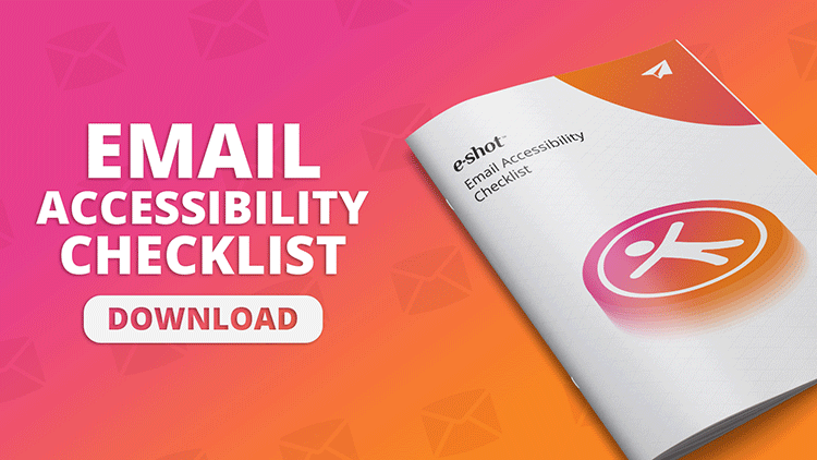
Want a little more help?
Use our simple list of checks to make sure that you have the basics right to ensure that every recipient gets a great communication experience.
Download e-shot's email accessibility checklistYou may also like these blogs
Accessibility Design Resources
Email accessibility checklist
May 16th, 2024 - Sadie Burgess
According to the World Health Organization, 2.2 billion people worldwide live with some form of visual impairment, with approximately 39 million...

Making accessibility accessible
August 3rd, 2020 - Sadie Burgess
From 23 September 2020, all public sector organisations have a legal duty to make sure websites meet accessibility requirements.The Minister for...
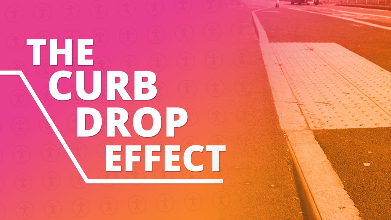
Improved accessibility is better for everyone
March 15th, 2023 - Sadie Burgess
The Curb-cut/curb-drop effect refers to the idea that designing for accessibility for people with disabilities ultimately benefits everyone. The...
Solutions
Email Marketing
Create email campaigns and newsletters and manage end-to-end subscription processes with forms and preferences.
Marketing Automation
Create sophisticated automated campaigns for email and SMS combined.
Digital Communication
The comprehensive solution to manage and automate your digital communication across email, SMS, websites and landing pages.
Email marketing healthcheck
We are confident that we can help you, which is why we offer a free healthcheck to identify potential issues with your current programme and free advice on things that could be done to improve it.