Blog
CATEGORY: Template showcase
Template showcase: Podcast template
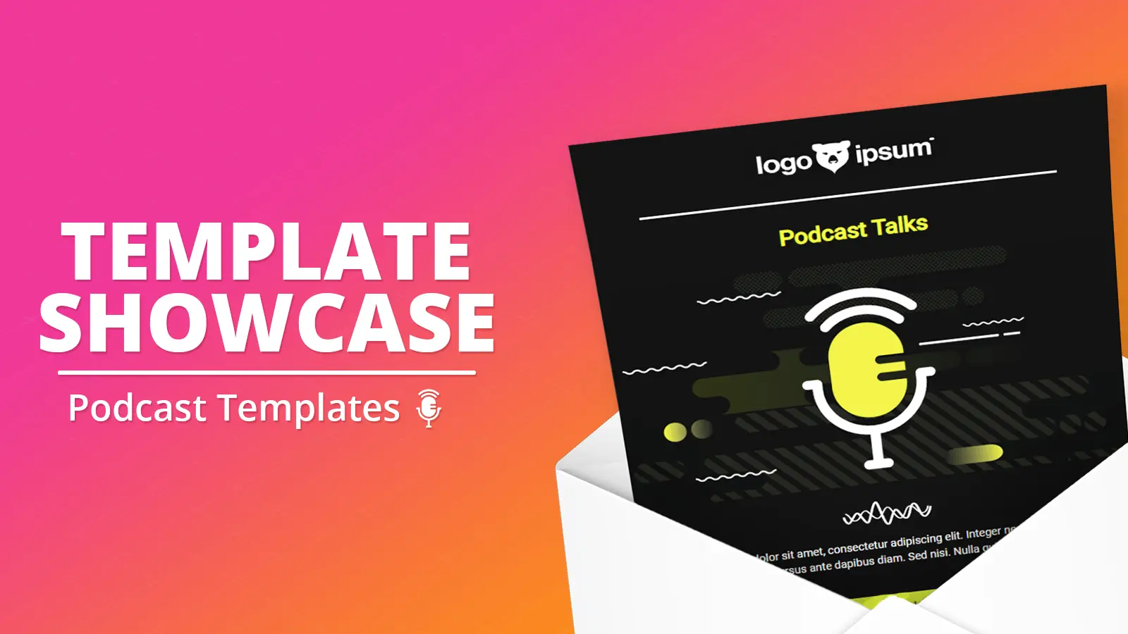
In this edition of our template showcase we are looking at design created with podcast promotion in mind which gave our design team many of the same challenges as experienced with video templates.
Why we love this template:
Designer
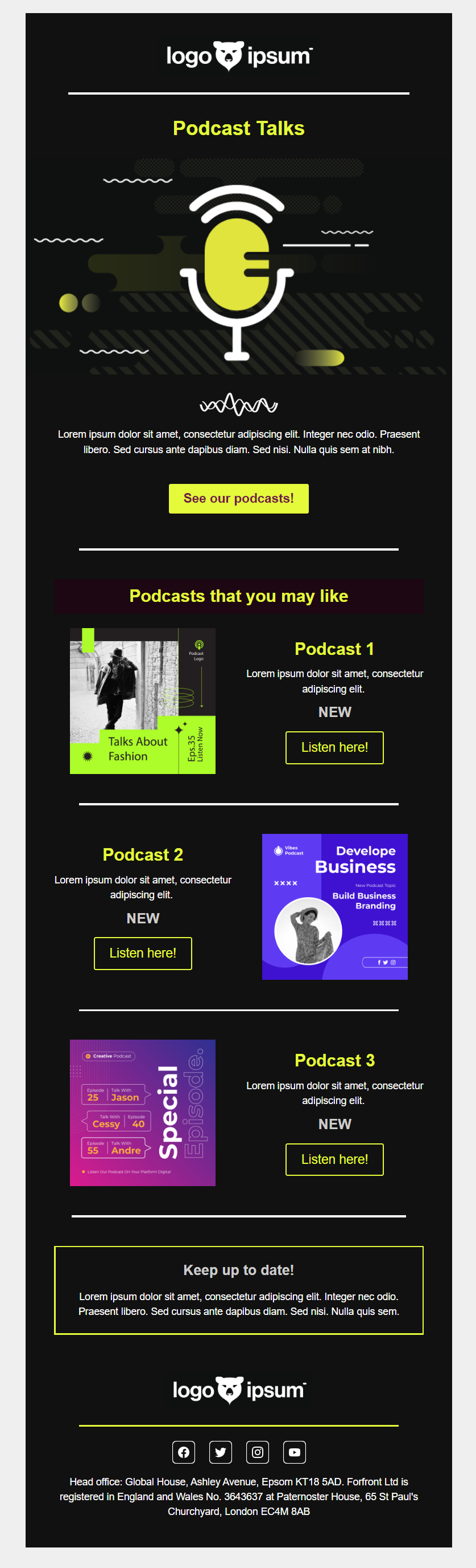
"This is a clean template that would be equally at home presented as light or dark mode. The consistent use of button colour makes this template look clean, and supports the CTA hierarchy and is reminiscent of a highlighter. The simplicity of the design, and the restricted use of text and colour palette, makes it ideal for audiences with additional accessibility needs or for those who render emails in dark mode. "
Techie
"The objective here is to give the best user experience possible, with the least friction in their journey. Because support for podcasts, more specifically autoplay, is not available the approach of this template was similar to that of video where it is necessary to give the illusion of control (where embedding video is unrenderable) and a smooth user journey to the intended destination - listening to the podcast advertised"
User
“This is a wonderful template as the hierarchy of action is so clear. The additional emphasis of the full colour button as the principle CTA, and then the addition secondary CTAs, in a newsletter style - enable you to highlight your "top podcast" as well as nod to the rest of your library, without detracting from the primary CTA. Accessible and a design that displays equally well regardless of device or colour mode it is rendered. Inclusive and effective”
Considerations when making it your own
Don't forget to link your primary heading image as well as the titles and button - even incorporating a play button could be considered (but choose your image wisely as you don't want to suggest the CTA is taking you to a video - and definitely avoid the youtube style play buttons).
This design is great in terms of accessibility and renders really well in dark mode - so don't forget to ensure that your images are set up correctly for a dark mode presentation - there are a few tips in our dark mode checklist.
You may also like these blogs
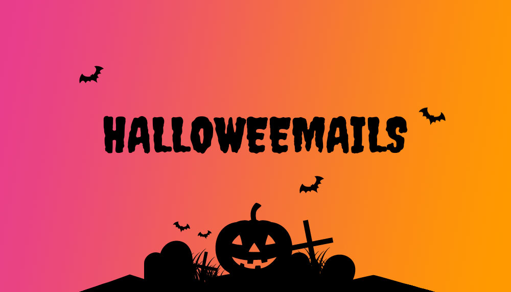
Halloween email templates
October 14th, 2021 - Dan Hare
Free Halloween email designsAvoid the horror of giving your emails a Halloween theme with our professionally designed templates.Each template has...
Template showcase: Basic template
June 8th, 2021 - Sadie Burgess
In this edition of our template showcase we are looking at our simplest design. But don't let the fact that the design is simple deceive you...
)-(Presentation)-(1000-x-563-px).jpg)
Public Sector Template showcase
Local Government email templates
November 19th, 2021 - Sadie Burgess
Our design team are always working hard to come up with new, engaging and useful templates, be it functional, seasonal or special interest. Each...
Solutions
Email Marketing
Create email campaigns and newsletters and manage end-to-end subscription processes with forms and preferences.
Marketing Automation
Create sophisticated automated campaigns for email and SMS combined.
Digital Communication
The comprehensive solution to manage and automate your digital communication across email, SMS, websites and landing pages.
Email marketing healthcheck
We are confident that we can help you, which is why we offer a free healthcheck to identify potential issues with your current programme and free advice on things that could be done to improve it.