Blog
CATEGORY: Designemail-marketing
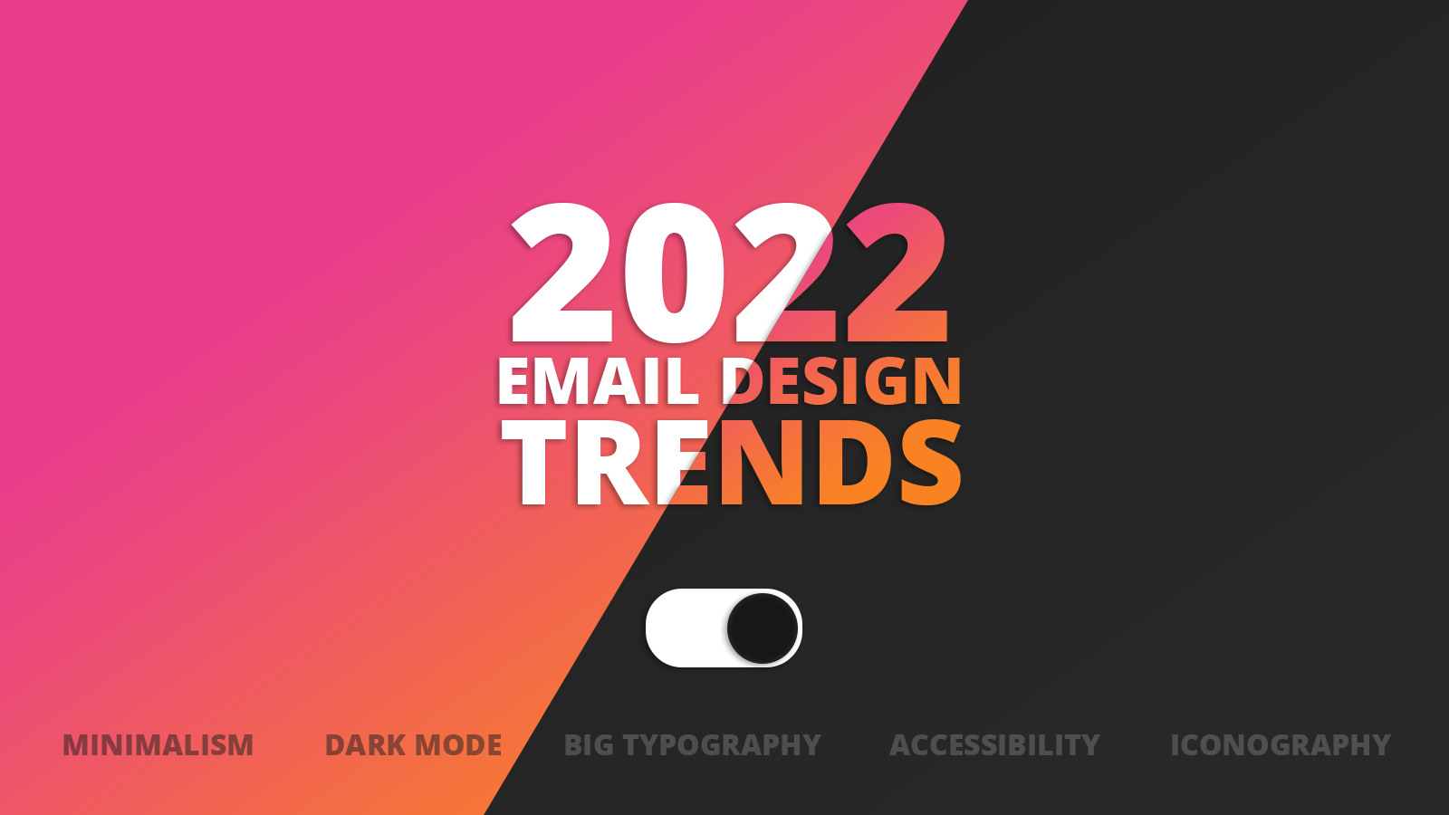
5 design trends to inspire your email comms (2022 edition)
Each year, we look to design trends to engage and inspire us, to provoke thoughts on new ways to communicate. New ways to get our message across visually reinforcing them with graphics and design that is modern and captures the ‘zeitgeist’.
And whilst this year is no different, as we review the hottest new design trends, what does feel a bit different is that there seems to be a slight divergence of email from the mainstream design when it comes to some aspects, with email designers having the conviction to have their own agenda.
But regardless of whether there is convergence or divergence in the design community, these are the highlights for 2022 that we hope will help inspire you and engage your audience.
1. Maximising and moderating minimalism
Clarity: Uncluttered, well-structured emails with a single objective and minimum irrelevant details are going to reign supreme in the upcoming year.
To put it simply, this trend keeps it short and sweet. Because people are bombarded with emails every day, this trend eases the burden by getting straight to the point and looking good at the same time.
Purpose: On the surface, this appears to be another minimalist trend, but that’s not exactly the case. This trend still takes full advantage of flashy graphics and animations, unlike minimalism which sticks only to the essentials. Likewise, you can still write longer-form newsletters, as long as there are no other major distractions, like a sales pitch or a survey. The focus stays on the text or the purpose of the email.
The idea for this trend is to keep things straightforward, instead of jamming different email pieces together.
Colour: In the graphic design world, this moderation of minimalism can also be seen with moves to ‘colourful minimalism’, as purist minimal is monochrome combining black text with white background. So minimalist design concept has been coupled with colour palettes that create beautiful combinations of sophisticated design with traditional minimalism.
Thinking about email…
The benefit of this in the email world, not only getting your message across more clearly, is that by considering the structure of your comms and use of colour and contrast in this way, you are also helping make your emails more accessible. Essex County council have already been on this journey and have some interesting insights that could help you too.
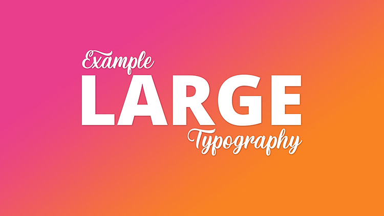
2. Big and bold typography
This next trend also seems complementary to the world of moderated minimalism. The use of big bold typography in contrast with a clean minimalist surrounding.
While some design trends focus on smaller and minimalistic, some are getting bigger and bolder. Typography is one of these. It’s the main method of communication within the email, so it needs to catch the eye. But there are some ground rules:
Don’t choose the entire text to be big and bold. Pick your headlines carefully and ensure it is emotive and positive.
Don’t match big and bold typography with similarly bold colours. It can be too much. Stick to neutral and muted colours and let the typography do the talking.
Don’t cram it all into a small space. Give it some extra room and make sure the readability is good on all devices.
Don’t miss out on a responsive design. Typography needs to work on the big screen and mobile devices, otherwise, it’ll put people off and look squashed.
The visual design used to be all about the hero image on an email. Not anymore. This fantastic trend has other positive implications for email specifically, particularly when you consider accessibility and approaching email design from a mobile first perspective. Big, bold text works brilliantly on a smaller screen, and if your headline is also coded with H1 tag this will help screen readers and even some with visual impairments achieve visual impact.
And, for all you time-pressured communicators out there, the consequence of your headlines being the overwhelming focal point is that they are given the time and consideration they deserve as the importance of getting them exactly right is almost tangible.
A note about fonts
There is a lot of talk in graphic design circles in the resurgence of Serif fonts in design. Consider these carefully for the world of email as their intricacy can make them harder to read on a small screen (mobile-first and all that) and also can present accessibility challenges compared to Sans Serif fonts. Also, the ability of every email client to be able to render “non-standard” fonts is patchy, so make sure you always include a fallback font or font-family.
So, I’m not saying don’t use them… just make sure you have thought about it first from your audience’s perspective.
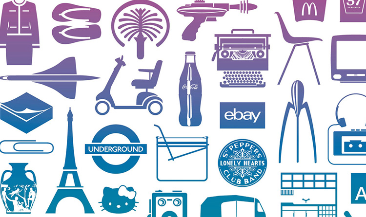
3. Icon‘ic’ design
Symbols are a very powerful thing when it comes to information transfer or an attempt to elicit emotions. Another peculiarity of symbols is that they are universal by their nature because they cross language and cultural boundaries, in some cases are easier for the brain to process and can be used as powerful signposts in communications.
Increased use of icons and symbols in design is another trend looking forward into 2022, and for those that already have this built into their branding and visual identity – for example a council’s crest – this is the year to bring it to the forefront.
Forget about minimal and straightforward icons in your design. 2022 is all about illustrated approaches, intricate and complex scenes, and, of course, bright colour palettes. Do not be afraid to use complex solutions to explain the product’s features or the advantages of your company.
In your own design projects, symbols and icons can be mysterious, playful and enticing. But our advice is use symbols alongside typography to avoid disappearing too far down the rabbit hole and leaving viewers confused rather than compelled.
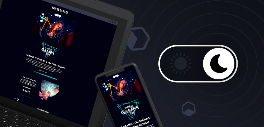
4. Dark mode developed
Dark mode has a bright future in email and that future is only getting brighter with designers really engaging with the ‘dark mode first’ design principle. And it is not surprising
81.9% of people use Dark mode on Android (Night Eye);
55-70% use Dark mode on iOS (Night Eye); and
64.6% of readers expect Dark mode to affect web pages automatically (Night Eye).
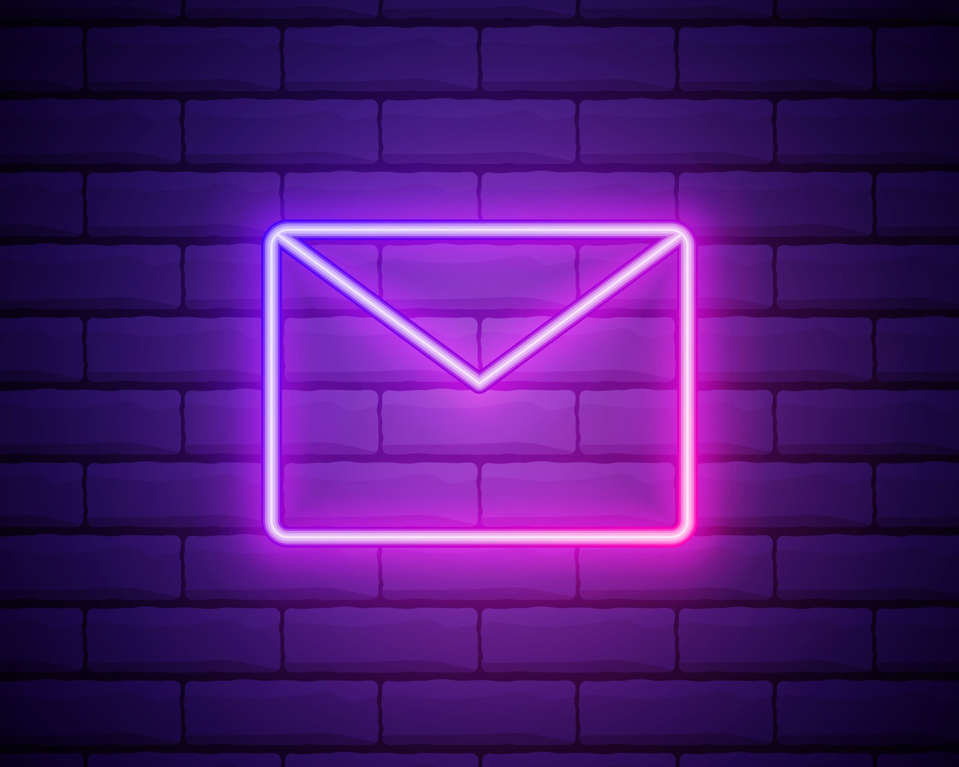
With designers embracing the dark canvass the emergence of neon, which has been on trend elsewhere for a while now, has come to the email space. The other design trends that will work particularly well with dark mode are:
Psychedelics and intense, retina-searing colours
Those in design circles talk about colour and its link to hope and optimism – and after the last couple of years, hope and optimism if definitely something we could all do with.
“It was no coincidence that we felt the need to go full-tilt bright this year in some of our colour choices.”
Jason Little, co-founder and executive creative director of For The People, who designed the identity for the Sydney Film Festival 2021.
Zuzanna Rogatty, senior designer at Collins explains.
“I hope it is actually a movement, a characteristic of the zeitgeist, a colour uprising, and not only a trend.”
The impact of this in a dark mode environment, email client, will serve only to highlight it more.
Retro resurgence
99 designs describe this trend as ‘soothingly nostalgic and oddly fresh’ and ‘the past reimagined for the future’.
- Joanna Alves, Creative Manager, Product Creation and Experience at Vista
One design trend that everyone is talking about is the fact that ‘the 90s are back’. 90s nostalgia with Memphis design patterns, simple emojis and primitive internet frames also plays into the resurgence of colour with bright colour blocks and dripping slime.
Anti-design
There are some new trends that it is hard to reconcile with email – even though the dark mode canvass would be a good foundation.
- Imogen Hoefkens, Art Director at 99designs by Vista
Whilst the aesthetics of this trend are brilliant – I would strongly recommend that it doesn’t permeate your email comms. Clashing colours, illegible text and the disregard of order and structure is not a good bed-fellow when you have a message you need to get across and a diverse audience and variety of clients to render your creation. My gut here is, if you have to proceed here, do so with the upmost caution – but in real terms leave this one for print and outdoor comms.
5. Engaging and interactive
While motion design has been gradually seeping into branding and identity systems for a few years now, the role that movement and kinetics can play in conveying the personality and the spirit of a brand is becoming increasingly evident.
Every year, email design trends embrace animation, movement and interactivity a little more. The appeal has always been there, but as technology evolved, designers can bring their ideas to life.
The email trends of 2022 are no exception, welcoming more animated GIFs, interactive menus, scroll animations and really any effect that increases reader engagement. Unlike previous years, however, it isn’t just about showing off the new technology but working it into the overall email message.
Micro-interactions which we are now accustomed to seeing in website design are filtering into email, and it is unsurprising that email has embraced this trend as the point that you interact with a mail is predominantly at the CTA.
Animation and movement is set to increase in popularity, and whilst AMP and the brave new world of AMP email has been slow to gain traction with 0.002% of emails using AMP according to Stripo’s annual report, the elements of movement, animation and interactivity that AMP promised are none-the-less of interest to email designers.
Animation is a top trend for email design; however, in 2022, do not overdo it. You need to be smart with dynamic gifs. Instead of being fully interactive and animated, combine static images with dynamic elements to reinforce the overall effect. This will create a fantastic visual depth, keep your loading time acceptable and give you control of what to show first to your subscribers.
Take a look at What is a Gif and why should I care.
Summary
In the words of Grace Fussell, Blue Whippet Studio;
“The message for graphic design trends in 2022 is to come as you are and push for authenticity. Individually tailored and emotive design that ranges from nostalgia marketing to soothing minimalism will help to transport viewers to their own happy place, whether they engage with print or digital designs.”
The 2022 email trends are a breath of fresh air, with bright colours, energetic animations, fun typography and a presentation catered specifically for the reader. All in all, email marketing in the new year takes a livelier and more optimistic approach that makes opening emails a joy.
You may also like these blogs
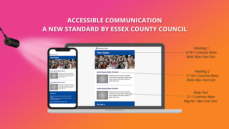
Public Sector Best practice Accessibility
Accessible Communication: A new standard set by Essex County Council
November 25th, 2021 - Sadie Burgess
This week we were lucky enough to attend the Public Service Communications Academy event.The Public Service Communications Academy (Academy) is a...
Embrace the darkness
October 11th, 2021 - Sadie Burgess
Dark Mode is taking over the inbox— the 2021 litmus report proports that the number of Apple users now embracing dark mode to view email is...
Solutions
Email Marketing
Create email campaigns and newsletters and manage end-to-end subscription processes with forms and preferences.
Marketing Automation
Create sophisticated automated campaigns for email and SMS combined.
Digital Communication
The comprehensive solution to manage and automate your digital communication across email, SMS, websites and landing pages.
Email marketing healthcheck
We are confident that we can help you, which is why we offer a free healthcheck to identify potential issues with your current programme and free advice on things that could be done to improve it.