Blog
CATEGORY: email-marketingDesign
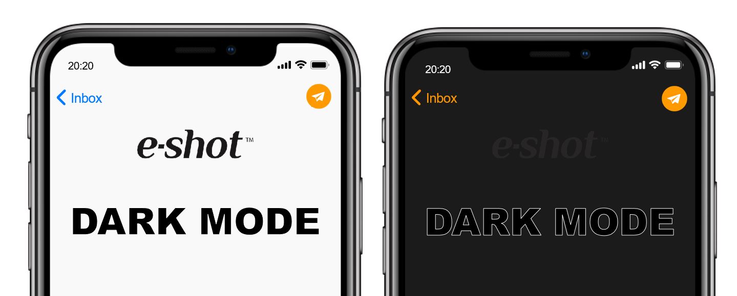
Embrace the darkness
Dark Mode is taking over the inbox— the 2021 litmus report proports that the number of Apple users now embracing dark mode to view email is significant. (With Apple being the biggest player in the world of email clients).
“We can currently see Dark Mode vs. Light Mode for iPhone iOS 13 and iOS 14 as well as Apple Mail 13. Altogether, Dark Mode makes up almost 29%! “
And with Google now offering the ‘Night Eye’ feature where you can apply dark mode to any website (as long as you are using Google Chrome) the continued growth of dark mode popularity has to be expected.
Making sure emails look great in this reading environment is the new big challenge for email marketers.
What is Dark Mode?
Dark Mode is a reversed colour scheme that utilises light-coloured typography, UI elements, and iconography on dark backgrounds—and it’s one of the hottest digital design trends in the past year.
Why do people prefer dark mode?
Light text on a dark background is much better for minimising eye strain, especially if you are reading in low-light.
It reducing screen brightness can save your battery life.
It can improve legibility.
Which email clients support dark mode?
These clients and apps currently offer Dark Mode—either as a setting that the user can set manually or by automatically detecting the user’s preferred colour scheme:
Mobile Apps
· iPhone Mail
· iPad Mail
Desktop Clients
· Outlook 2019 (Mac OS)
· Outlook 2019 (Windows)
Web Clients
· Outlook.com
· Hey.com
But just because all these email clients offer a way to set their UI to a dark colour scheme, that doesn’t mean that they handle your emails the same ways. Litmus tested the Dark Mode settings in the following email clients to see how they impact a regular email that doesn’t include any Dark Mode-specific targeting. Here’s what they found:
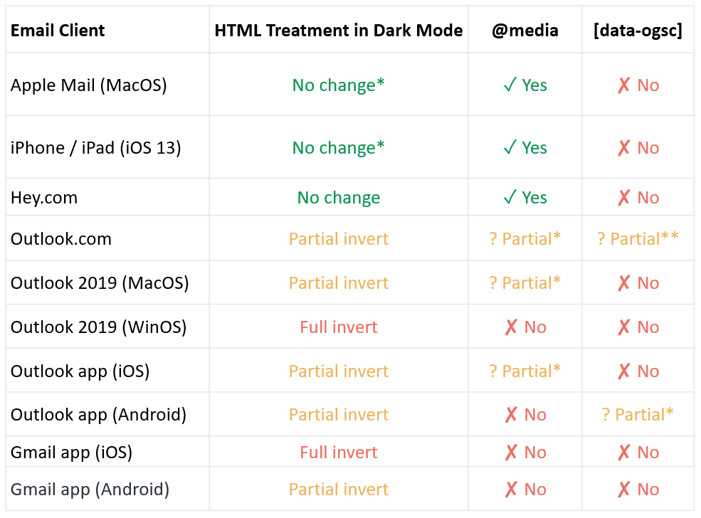
* Some BG colours will be darkened
** Image swap works
More information is available in litmus' full guide.
If your subscribers are making that conscious decision to view emails in dark mode, it’s best to respect that. Just like you’d want to add ALT text in case your users prefer to have images off by default, you should build emails that respect darker interfaces, too.
While there’s plenty of advice out there for adequately optimising your email content for the average inbox, email marketers need to start learning how to work with both dark and light optimisation simultaneously, so that their audience can view these emails without issues.
Some things to consider even if you are not ready to fully commit to the dark side
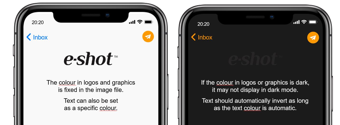
1. Consider how your logo or icons will appear in both standard and dark modes; Do you have a dark/black logo or white logo which will not show up to one or the other audience? Do you need to consider how you will ensure standout of your logo in either view. Equally you may think that the 'watermark' type appearance of a dark logo on a dark background is effective and your branding is adequately represented elsewhere that this is not an issue - but the only way to know is to take a look.
2. Think about how your buttons will appear and ensure you don't lose the power of your CTA with a colour change. Your buttons need to retain both their stand out from the background and the link text within the button needs to be legible even when the button undergoes a dark mode colour change.
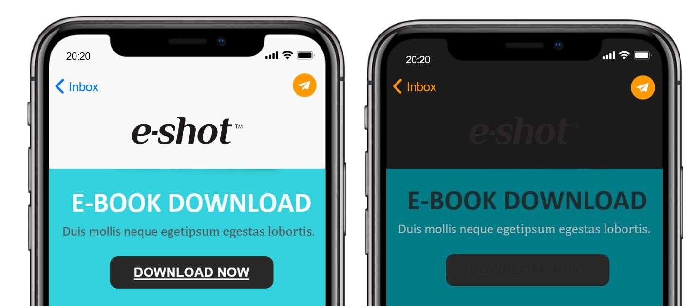
3. Use transparent PNGs. A transparent image will allow the background colour change to seem more seamless with the design still intact. If your images are not transparent and include backgrounds ensure that there is enough padding to make this background appear more of a frame than a clipping path (which would appear more like an error to the recipient)

4. Avoid mixing images and background colours. While many graphic designers may combine images and background colours to create buttons and other design elements, it may not be wise if you’re trying to implement both dark and light optimisation. Remember, if you’re using background colours, they’re likely to change between the dark and light modes, whereas images won’t.
5. Do you need to outline your dark fonts to ensure that they stand out? When it comes to the fonts you choose, one hack that email on acid suggest is to try is adding a white keyline around your darker fonts. While the white keyline won’t show up much, if at all, in lighter settings, in dark mode, it’ll help define your text, making it easier to read.
6. Don’t guess, test!
Always make sure you test and view your tests in both light and dark modes, because sometimes clients simply will not render as you expect.
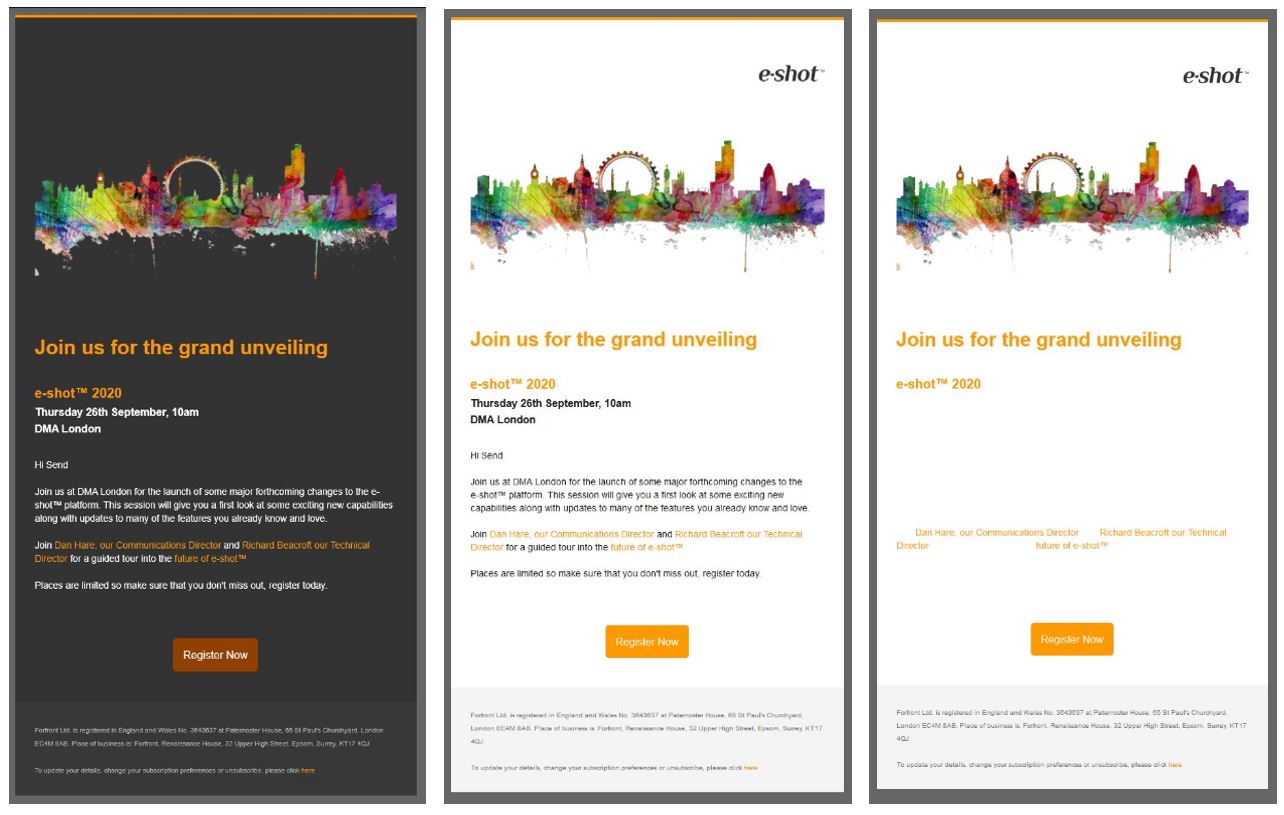
This is 3 examples of the same campaign, the image in the centre is the standard mode rendering. The two outside are two versions of outlook that treat the message in different ways in dark mode - as as you can see, whilst the image on the left behaves as you might expect, on the right the engine has chosen to reverse the text, but not the background colour of the email - giving very helpfully white text on a white background.... So as you can see, without looking at multiple clients to see how they will display your email you cannot be certain that the changes you make are going to work in all incarnations of your message.
If you only take one thing from this first article in our dark mode series it has to be: Don't guess, test and check!!
Download our checklistYou may also like these blogs
Email A/B Testing Best Practices
July 1st, 2017 - Harry Thomas
A/B testing, also known as split testing, is a method of comparing two versions of an email (A and B) to see which one performs better. The A/B...

Email Forensics update
January 24th, 2019 - Sadie Burgess
Deliverability is key to a successful email marketing program. After all, subscribers can’t engage with emails they never see. But, around one in...
Solutions
Email Marketing
Create email campaigns and newsletters and manage end-to-end subscription processes with forms and preferences.
Marketing Automation
Create sophisticated automated campaigns for email and SMS combined.
Digital Communication
The comprehensive solution to manage and automate your digital communication across email, SMS, websites and landing pages.
Email marketing healthcheck
We are confident that we can help you, which is why we offer a free healthcheck to identify potential issues with your current programme and free advice on things that could be done to improve it.