Blog
CATEGORY: AccessibilityBest practice
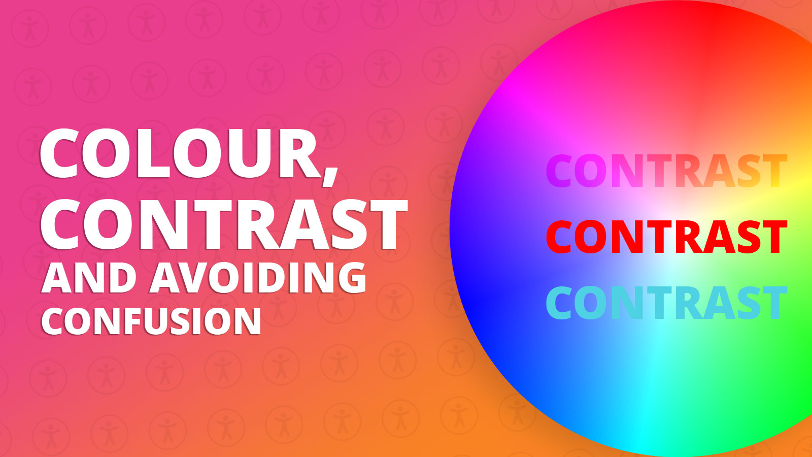
Colour, contrast and avoiding confusion
Colours are like powerful messengers. They can show when it's time to do something, change how we feel, and even affect our bodies. Some colours might make our heart beat faster, make us burn energy faster, or strain our eyes.
Choosing a colour for you CTA
As we are all aware, CTA’s are vital and should be included in each and every email design that you create. CTA’s aren’t just buttons, they’re ways to explore your content and guide your recipients down a specific path. A clear and concise CTA eliminates confusion for recipients. They know exactly what you're asking them to do, making it easier for them to decide whether to take action.
With more use of mobile devices, CTAs help create a seamless experience for users who open emails on their smartphones or tablets. As well as larger buttons being easier to interact with than text links on small screens.
Selecting the right colour for an email button relies on various factors, such as your brand guidelines, the complete email design, and how colours can affect people's emotions.
Red: Using the colour red as your CTA can drive a sense of urgency, catch attention, and stimulate action. The colour red has a powerful impact on human psychology. It can increase heart rate which is why it's often used for "Buy Now" or "Limited Time Offer" buttons.
Green: the colour green can present feelings of positivity and action. Green is frequently linked to "Go" or "Start" actions. It can create a feeling of encouragement making recipients more inclined to click the button.
Yellow: This colour can give someone a feeling of warmth. Yellow is a colour that grabs attention and can stand out effectively, especially against neutral or darker backgrounds.
Blue: Blue is often associated with reliability and security. Using blue for a CTA colour can create a feeling of trust which would be useful for actions that involve signing up or making a commitment.
Orange: Orange is a vibrant colour that naturally draws attention giving off feelings associated with excitement, creativity, and friendliness. It can make recipients feel more comfortable and willing to engage with the CTA.
Black: When incorporated into a CTA black can convey sophistication, elegance, and authority. The colour black can work especially well for actions like enrolling in premium services and gaining access to exclusive content.
White: White is often associated with purity, openness, and minimalism. Although white might not capture attention as well as other brighter colours, its simplicity can convey feelings of reliability.
Brand guidelines
Brand guidelines consist of rules and suggestions that explain how a brand should look, feel, and be shown in different places. Following these guidelines is very important, and here's a few reasons why:
Consistency: They make sure your brand looks the same everywhere, so people recognize it easily.
Trust: When things look the same, people trust your brand more.
Stand Out: Guidelines help you look unique and makes your brand look strong against competitors.
Whilst understanding colours is important and choosing the right colour in your design is something worth thinking about, it’s also a good idea to know your brand guidelines and abide by these rules.
Accessibility
Accessibility is vital in your CTA because it guarantees that everyone, no matter their abilities or disabilities, can reach and utilise products, services, and digest information. Our eyes and brain are good at seeing shapes and colours, but some people have trouble telling certain shades or colours apart.
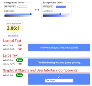
Below is an example of a colour that is non accessible. WCAG 2.0 level AA requires a contrast ratio of at least 4.5:1 for normal text and 3:1 for large text. However the colour shown below only has a ratio of 3.06:1.
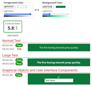
This next example is showing a colour ratio above the recommended minimum. It is important to understand that even though the colour is above the minimum ratio, it still does not pass each text version.
There are many other ways in which you can make sure that your email design is accessible and if you would like to find out more take a look at our Making Accessibility Accessibly blog.
Dark mode
Another aspect to keep in mind when thinking about the design and accessibility of your campaign, is how your emails are presented in dark mode. Dark Mode is a popular design trend from the past couple of years that uses light-coloured text, icons, and elements on dark backgrounds. It's a reversed colour scheme that's been widely adopted in digital design.
However, the appearance of colours in dark mode can change depending on the email client you are using. This happens because various email clients might interpret and show colours differently due to their own settings and preferences.
If you’re an e-shot customer, you can check this using the email forensics tool. This will enable you to see your email preview on over 40 email clients on dark mode, mobile and tablet view. This means that when creating your emails, you can see what your CTA designs will look like in dark mode to make sure that they will still catch your recipients’ attention.
This blog has discussed why it is important to think about what colours you are using within your email design. When creating your email, they key points to think about include the different thoughts and feelings colours can create, how accessible colours are and the importance of knowing how colours are shown in dark mode. Understanding these key areas of colour can benefit you and the reader from getting the most of your email design.
You may also like these blogs
Accessibility Design Resources
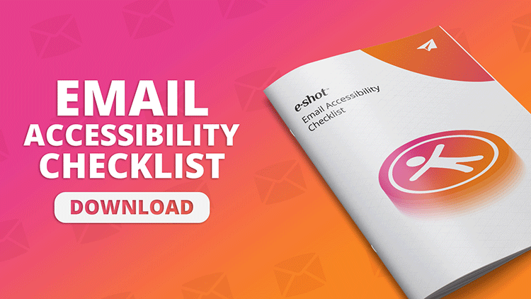
Email accessibility checklist
May 16th, 2024 - Sadie Burgess
According to the World Health Organization, 2.2 billion people worldwide live with some form of visual impairment, with approximately 39 million...
Improved accessibility is better for everyone
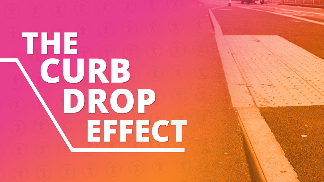
March 15th, 2023 - Sadie Burgess
The Curb-cut/curb-drop effect refers to the idea that designing for accessibility for people with disabilities ultimately benefits everyone. The...
Solutions
Email Marketing
Create email campaigns and newsletters and manage end-to-end subscription processes with forms and preferences.
Marketing Automation
Create sophisticated automated campaigns for email and SMS combined.
Digital Communication
The comprehensive solution to manage and automate your digital communication across email, SMS, websites and landing pages.
Email marketing healthcheck
We are confident that we can help you, which is why we offer a free healthcheck to identify potential issues with your current programme and free advice on things that could be done to improve it.