Blog
CATEGORY: Best practice
Form & landing page design best practice
In this blog we will cover some best practice tips for when you are creating your forms and landing pages. We will cover some generic best practices as well as how e-shot can also be used.
Firstly, let's cover what a form and landing page are!
What is a form?
In digital marketing, a form is an online tool used to collect information from users. Forms are a crucial component of many digital marketing strategies, as they facilitate interaction between an organisation and its audience.
Some key use cases for forms in marketing include:
Event registration
Subscriptions such as email
Surveys and feedback
What is a landing page?
In digital marketing, a landing page is a standalone webpage designed for a specific purpose. It is where the visitor ‘lands’ after performing an action hence the name ‘landing’ page. You will likely come across landing pages daily, as examples include links you regularly click, such as ones inside an email or on social media.
Landing page best practices
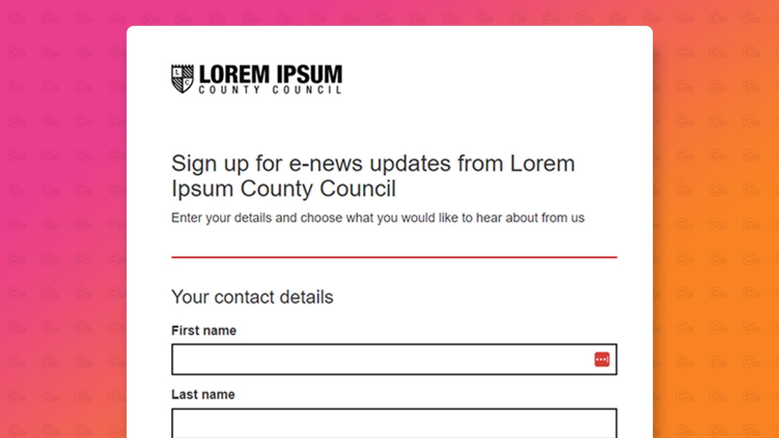
Clear and compelling heading title: Make it clear what the page is meant to do for example if it is a ‘thank you page’ ensure the heading thanks the user for performing the action e.g. signing up to receive emails. The headline should always align with what's on the page and what the user has clicked to land on that page. Below is an example of a simple sign-up form heading and detail.
Focus on a Single Goal: Each landing page should have one objective or purpose. A landing page isn't designed to contain loads and loads of different information. It is also best to avoid multiple calls to action.
Strong Visuals: If you are using imagery on your landing page, ensure they not only help to make the page more visually appealing bit also support the message on the page.
Compelling Copy: The copy on your landing page should be clear and concise. It should highlight what the page is about. Remember in most cases, less it more. Use headings, subheadings and short paragraphs to make the content easy to read and digest.
Consistent branding: The design and look of the page should match your brand e.g. ensure you are consistent with logos, colours, fonts and tone of voice. See below the red colour has been used been throughout the page, including the main subscribe call to action button.
Minimal navigation: Reduce distractions by having minimal navigation on the page. Ideally the landing page should have no navigation bar and just one clear call to action.
Responsive design: Your landing page should look good and function well on all devices such as desktops, tablets and smartphones. You don't want someone to abandon your landing page as they aren't able to take in the information on the page properly.
Forms best practices
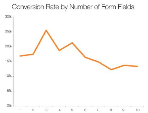
Less is more: Only ask for the details you need! The fewer form fields the better, and the more likely it is to get completed. See the below graph (Source).
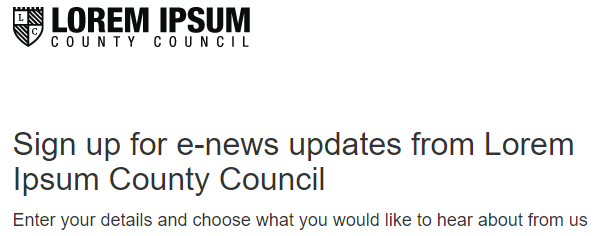
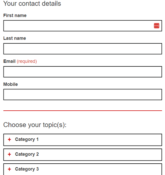
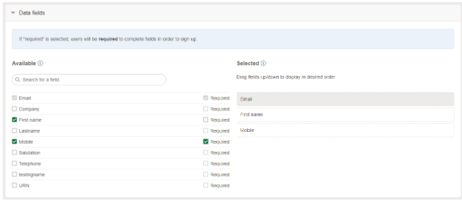
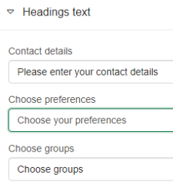
Logical flow: Organise form fields in a logical sequence that makes sense to users. Group related fields together and aim for a logical linear progression. See below, the order follows the contacts name, then their contact details. It would not make sense to ask for the contacts first name, then their mobile, followed by their last name and email.
Clear Labels and Instructions: Provide a clear label for your fields particularly those that require a more in-depth response such as a long text field.
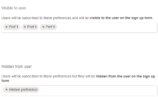
Single-Column Layout: Use a single-column layout on your form to improve its readability, making it easier to complete. This also helps to keep the form responsive on mobile devices. As per the above images, you will see our contact fields and the options to which you can subscribe to are all in a single-column layout.
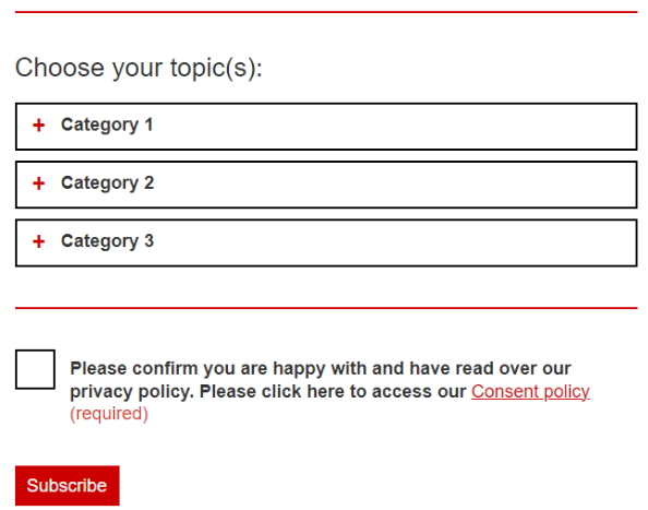
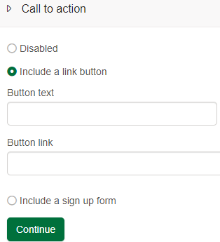
Prominent Submit Button: Ensure the button on your form stands out visually and uses descriptive text to reinforce the action the user is taking. For example, ‘Sign up now’ or ‘Download our free guide’. Use of a clear call to action, see below a clear button that stands out at the bottom of the page.

Progress Indicators: For forms that require several pages e.g. multi step forms, ensure progress indicators are used to show the user how far they are along and what steps remain.
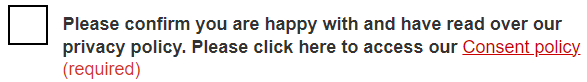
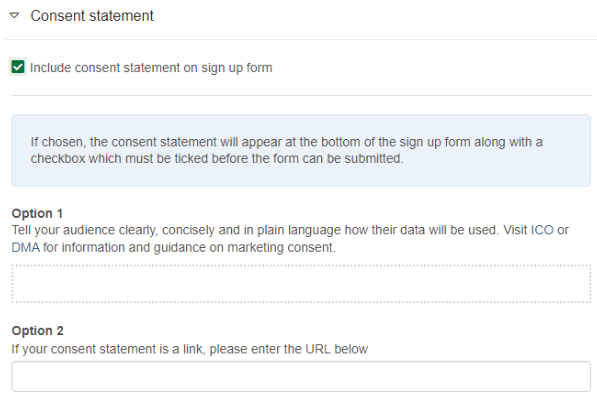
Privacy and Security Assurance: Always include statements about how the information collection will be used and reassure the user that their data is secure. You can do this by including a link to your privacy policy if necessary.
A/B testing: Just like when sending emails, A/B testing can be used for forms also to identify what works best. Testing could include using different fields or placing the form in different positions on a webpage.
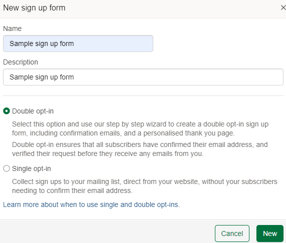
Double opt-in: Double opt-in forms are considered best practice as they help to ensure the quality of your data collected. By using double opt-in, you can almost guarantee everyone who fills in the form is interested in what it was offering. Whereas with single opt-in forms, anyone can sign up any email address, which also increases the chances of your form being spammed.
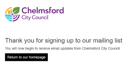
Thank you pages: After filling in the form, it is important you direct the user to a landing page of some sort. For example, thanking the user for filling in the form and if you are using a double opt-in form, it is good to remind them they need to head to their emails to confirm their sign-up. See below, a perfect example from one of our customers using a thank you page landing page.
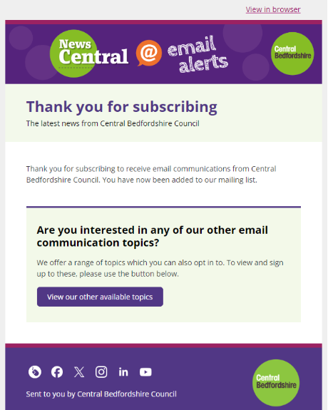
Welcome emails: If the purpose of your form is for a newsletter or email subscription. We strongly advise sending some form of welcome email. Why is this? If you imagine you send a newsletter at the end of every month, but someone subscribes at the start, it will be some time until they receive any emails from you. Your welcome email can be as simple as a thank you with some details as to what your emails are going to offer. Remember a new subscriber is always the most engaged within the first couple weeks of signing up! See below a simple welcome email from one of our customers, thanking the contact for subscribing as well as promoting them to have a look at the other topics they have available to subscribe to.
Forms and landing pages in e-shot
Within e-shot there is a builder forms and landing pages designed. For the details on setting these up, you can find our form help article here and our landing page help article here.
But let's take a look at how e-shot can help with some of the points mentioned previously.
Option to create both a single and double opt-in form
Full control over your data fields including the order and whether the filed is required or not.
Ability to show and hide your subscription options as well choose the order.
Easily enable a privacy/consent statement either by using text or a link
Full control over the heading text on your form
Full control over the text within the call-to-action button

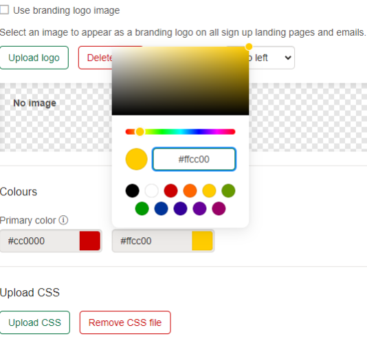
Ability to control the branding on the page on a basic level by uploading a logo and choosing colours. Ability to upload a CSS file is available.
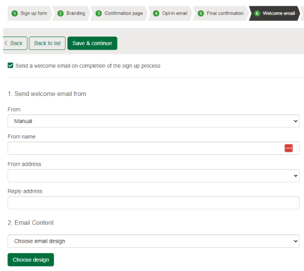
Control over various messages including an initial confirmation page, an opt-in email, final confirmation page and a welcome email.
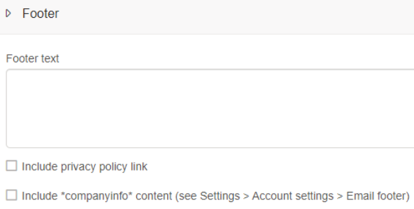
The same controls such as branding, text and your footer/privacy link are available also on e-shot landing pages
For landing pages, you have the ability to have no call to action, choose your own or host an e-shot form on the page
More useful links on forms and landing pages can be found below:
e-shot forms and landing pages video walkthrough
e-shot landing pages help guide
Embedding a sign-up form on your website
That’s a guide as to how e-shot can help you achieve some of the best practices discussed. If you’re an e-shot customer, feel free to contact support if you need any assistance.
Likewise, if you’re interested in potentially becoming an e-shot customer, you can view our pricing page, request a demo and a call back here.
You may also like these blogs
.png)
Forms & landing pages walkthrough: Platform overview
March 26th, 2024 - Harry Thomas
Collecting sign ups is a key aspect of email marketing. Forms, landing pages and preference centres make this possible as they allow for users to...
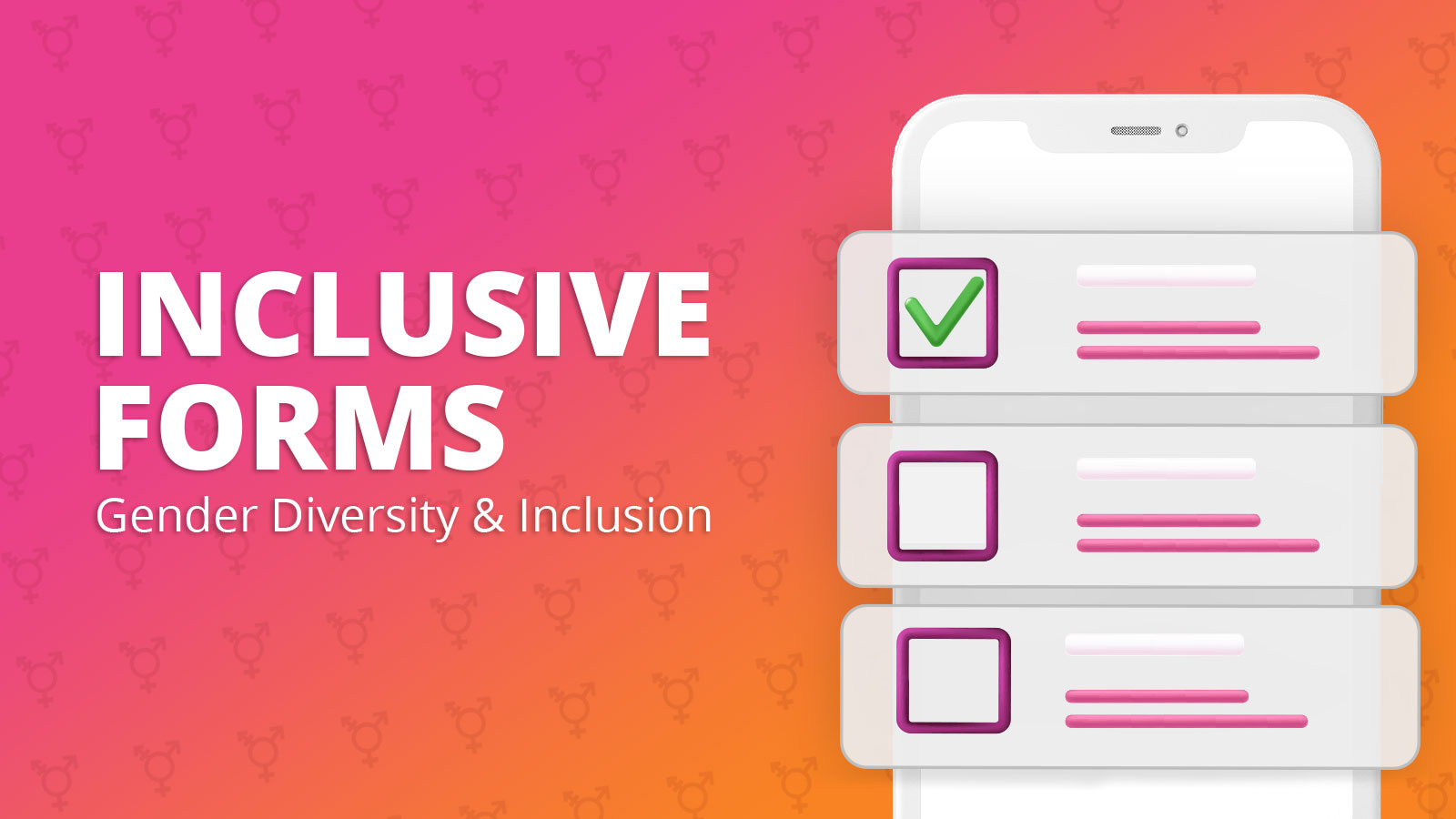
Designing forms for gender diversity and inclusion
February 20th, 2023 - Sadie Burgess
We understand how asking about someone's gender on a form can be a sensitive and controversial issue. Gender is a personal characteristic, and...
Solutions
Email Marketing
Create email campaigns and newsletters and manage end-to-end subscription processes with forms and preferences.
Marketing Automation
Create sophisticated automated campaigns for email and SMS combined.
Digital Communication
The comprehensive solution to manage and automate your digital communication across email, SMS, websites and landing pages.
Email marketing healthcheck
We are confident that we can help you, which is why we offer a free healthcheck to identify potential issues with your current programme and free advice on things that could be done to improve it.