Blog
CATEGORY: Template showcase
Template showcase: Newsletter template 1
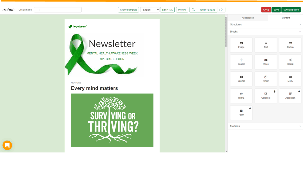
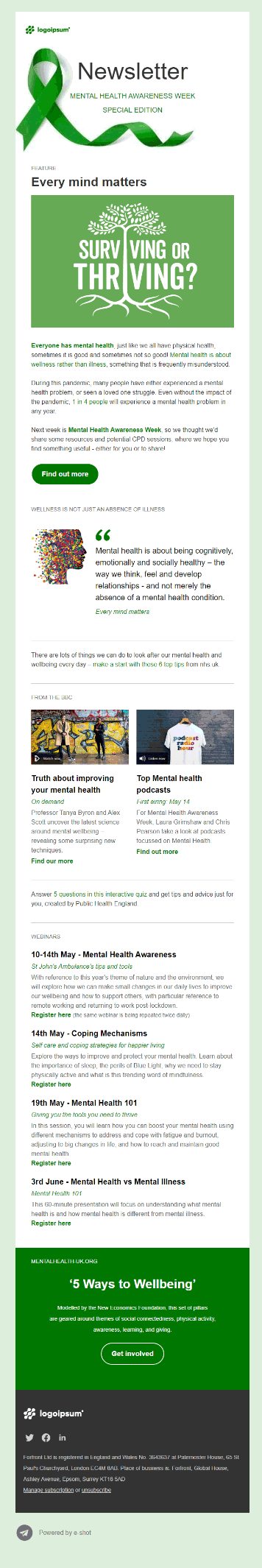
In this edition of our template showcase we are looking at a newsletter design template that uses a restricted colour palette and a variety of layouts to maintain reader engagement for a longer newsletter format.
Why we love this template:
Designer
"The key thing with this design is the flow and the clarity that is brought by the restricted colour palette and the use of white space - so although there is a great deal of information being conveyed the reader is not overloaded"
Techie
"A wonderfully mobile responsive email that stacks perfectly in any reading environment. Clean, spacious and very easy to read."
User
“With lots of information to convey, the variety of layouts within the structure of this Newsletter keeps the reader scrolling. Supporting images are there, but they enhance the message rather than being the message – so even if images are not activated, the mail it is still aesthetically pleasing.”
Considerations when making it your own
You can easily customise the colour palette (in general settings) to fit with your brand colours or accentuate your message, but to keep the colourway effective suggest that the background colour and the link and button colours are related (see our blog on use of colour in email [link])
Sections within the template can be extended or reduced i.e. you could replicate the 2 column image/text/link block to provide a grid of 4 or reduce the Text only section towards the bottom to only contain 2 articles.
If, for your mail, you look to replicate the quote section – as this is distinctive in the layout, we would suggest that you place that away from the original quote section, so they don’t sit directly one-above-the-other.
Your two most prominent CTAs are the buttons at the beginning and the end of the email – coloured button at the top and the button within the coloured last block. Ideally you want these to both point to the same place - you primary CTA – these are the elements likely to have the highest click rate so use them wisely.
Solutions
Email Marketing
Create email campaigns and newsletters and manage end-to-end subscription processes with forms and preferences.
Marketing Automation
Create sophisticated automated campaigns for email and SMS combined.
Digital Communication
The comprehensive solution to manage and automate your digital communication across email, SMS, websites and landing pages.
Email marketing healthcheck
We are confident that we can help you, which is why we offer a free healthcheck to identify potential issues with your current programme and free advice on things that could be done to improve it.