Blog
CATEGORY: Designemail-marketing
Using Menus to make your contacts hungry for more
There has long been debate on whether the inclusion of a menu within email is a good idea or not – and as with all things email it seems – the answer is simply not black and white.
“It depends….”
So, if you are thinking about creating a new email template or simply a one-off campaign, there are several things to consider when deciding if the inclusion of a menu is the right thing for your campaign.
There is, however, one thing to remember that is often forgotten. If you choose to put a menu within your email, this does not automatically mean that you have to replicate the menu that you have on your website.
Whilst there may be occasions when replicating your website main menu is a good idea, bringing consistency, familiarity, and full access to your brand proposition – don’t forget that when designing your email, you have the possibility to tailor your menu to fit your message. .
To be effective, your menu bar should relate to your email content:
Relate the menu to the main email call-to-action. You could recreate your full website menu, but it may distract some of your contacts from your main message or call-to-action. Instead, look for links on your website that either relate to your call-to-action, or support it with additional information. Save anything that doesn't fit for another email.
Use your menu links to start a sequence. Use your recipient’s behaviour to trigger a second message – if they click on a particular menu option, send them a follow up email based on their choice.
Don’t overload your creative with too many categories or menu options. It will create clutter and make them hard to act on – and when your message is read on mobile, the stacking will simply push the main body of your message down and down and down.
Make sure there is lots of padding around the text with minimum 14 px font size making it easily tappable. With so many people accessing their email via their mobile devices, your menu needs to be ‘finger-friendly.’
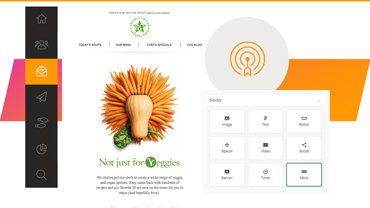
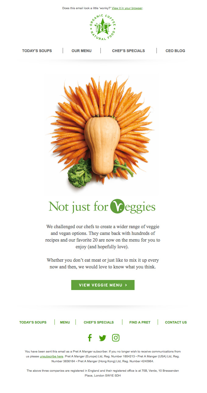
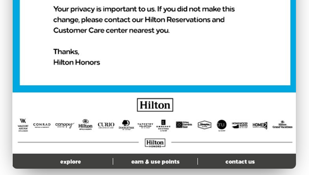
Consider your message hierarchy and the function of the menu that you are planning to include. In the Pret example below, the menu structure is used twice – to top and tail the email. With different links, where the header focuses the links around the content, the footer offers other ways to get in touch or find out information.
And most importantly
Using a menu is not a “get out of jail free card” or an excuse for poor targeting. If you are using a menu, it is there to support your brand or your message as a softer CTA it is not a catch-all tactic to try and get clicks you would have otherwise lost because your message was not suitably relevant to the recipient.
What is a menu meant for?
For recipients’ convenience, to let them get to the right landing page on your website faster.
Using this example from Pret – available for view at www.reallygoodemails.com we can see the menu functionality used very effectively.
In the first menu, at the top of the email, the menu items are linked to the promotional content of the email and are clearly part of the key message hierarchy, including a softer CTA to link to the full menu if the veggie route is not for you. At the base of the email there is a second menu structure, this time muted by clever use of the brand colour, that gives additional contact options and the Find A Pret.
My guess is that the menu at the base of the email forms part of their email template structure and appears on all their messages – so recipients are accustomed to seeing it and know where to go to find those key menu items – but this is an assumption on my part based on the layout – I would need to see more messages to confirm that theory.
3 reasons why we like menus
Menus can bring balance to your design as well as giving alternative routes for your recipients to travel.
Menus can offer an alternative or softer, complementary CTA.
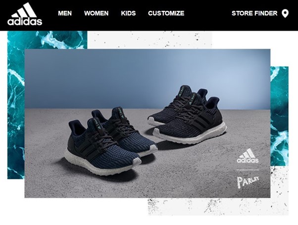
In this instance it maybe that the recipient would wish to try on the trainers before purchasing them – so the link to Store Finder assists with their customer journey rather than leaving them stranded if they are not ready to purchase directly.
Your menu doesn’t have to be in the header – just because that is where we are used to seeing them on websites… The footer can work just as well and offer less distraction from your CTA.
Or as we saw with the Pret example earlier, you can have a header and footer menu – and they can point to different things!
And we don’t think twice about having social icons in a menu style at the base of our emails.

But we will talk to you more about social in “Let’s get social.”
For a step-by-step guide to building menus using Smart Editor, take a look at our dedicated article [LINK], where we talk through how to build a text only menu, an icon-based menu and the text and icon menu option.
You may also like these blogs

Back to Basics: Social Media buttons in your email
March 9th, 2021 - Sadie Burgess
Datareportal reports that there are 4.2 billion social media users around the world at the start of 2021, equating to more than 53% of the total...
Solutions
Email Marketing
Create email campaigns and newsletters and manage end-to-end subscription processes with forms and preferences.
Marketing Automation
Create sophisticated automated campaigns for email and SMS combined.
Digital Communication
The comprehensive solution to manage and automate your digital communication across email, SMS, websites and landing pages.
Email marketing healthcheck
We are confident that we can help you, which is why we offer a free healthcheck to identify potential issues with your current programme and free advice on things that could be done to improve it.