Blog
CATEGORY: DesignPublic Sector
2025 inspiration: Email design
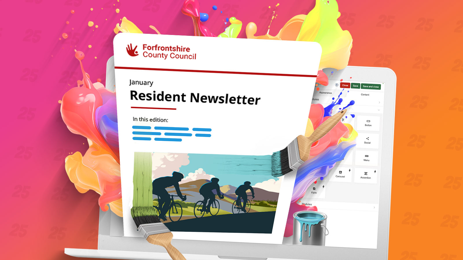
While subject lines and content remain crucial, the design of your emails plays a pivotal role in capturing attention and driving engagement among residents, stakeholders, and community partners. Striking a balance between creativity and data-driven precision is key to staying ahead. The following are our suggestions on how to stay ahead of the curve in 2025 to inspire you and invigorate you to revamping your emails this year.
1. Hybrid approach to content and design
YouTube Shorts and TikTok show how important it is to have short and fun content. You only have two seconds to catch someone's attention with your email subject line. You don't have much longer to keep that attention with the email content.
With the average attention span now just 47 seconds, adopting single-message email or digest formats in newsletter email design can help readers quickly locate relevant information.
Using fewer words in your emails and focusing on one main article can help people engage better. It also makes it quicker for you to write emails.
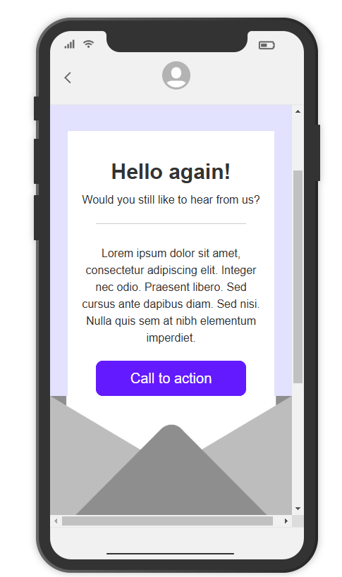
2. Personalised experiences
Personalisation continues to dominate. Beyond addressing residents by name, tools like NiftyImages and Hyperise enable communicators to create dynamic visuals tailored to individual preferences, such as personalised banners or localised information. These touches make emails feel bespoke, increasing resident engagement and trust in local services.
3. Bold typography and colour
Using larger fonts to create visual hierarchy emphasises key information, making emails easier to skim. Bold colours and colour blocking enhance readability and highlight distinct sections, adding vibrancy and structure to email layouts. These techniques ensure your emails stand out amidst the influx of digital communications residents receive.
4. Micro-animations for engagement
Micro-animations, such as subtle GIFs or hover effects, provide a dynamic yet unobtrusive way to draw attention to key elements. For local authorities, this could mean highlighting deadlines for public consultations or showcasing upcoming community events in an engaging manner. Testing these animations in both light and dark modes ensures they remain effective and visually appealing across all devices.
.gif)
5. Accessibility and inclusivity
Emails that are easy to read and understand get more attention. People who can't see well need descriptions for images to know what they are. Others who block images for security also need these descriptions.
Using short and simple words helps all readers, especially those with different learning styles and people who are busy. This way, everyone can quickly understand your message.
Don’t forget to check the accessibility of your emails using our Preview tools.
We also now offer regular training sessions on email accessibility to all customers.
For local authorities, prioritising accessibility ensures that all members of the community can engage with important updates and services. Dark mode compatibility not only supports accessibility but also aligns with growing user preferences for more visually comfortable viewing options.
6. Mobile-first design
Mobile devices account for 68% of internet traffic, making mobile optimisation essential. Emails must be responsive and tested across devices to ensure seamless viewing experiences. With Apple Mail’s changes in iOS 18—including digest views and spatial email features—local authorities must adapt to maintain resident engagement and trust in their digital communications. Ensuring mobile designs function seamlessly in dark mode further enhances user experience.
7. Sustainability in email practices
Eco-conscious residents expect their councils to reflect shared values. Sustainable email design—including lightweight HTML, optimised images, and minimalistic layouts—can reduce your campaigns’ carbon footprint. Encourage readers to delete emails after reading to further this effort. Highlighting your commitment to sustainability can strengthen trust and build goodwill within the community.
Simple practices, such as reducing image sizes, limiting complex HTML code, and designing with dark mode in mind, can make a significant difference. For example, dark mode not only reduces eye strain but also conserves energy on devices with OLED screens, directly aligning with eco-friendly principles. Local authorities can take the lead in promoting environmental awareness by transparently sharing their sustainable efforts in email footers or links to environmental initiatives.
Sustainability goes beyond design. By combining eco-friendly practices with clear messaging, councils can position themselves as responsible stewards of public resources, building stronger connections with environmentally conscious residents. Small, thoughtful changes in email strategy can amplify your sustainability message, showcasing your commitment to a greener future.
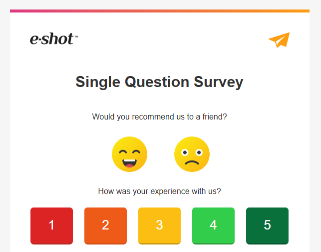
8. Interactivity and gamification
Your emails are about your subscribers, not about you. If your subscribers think that you value them, then they are likely to give feedback.
Simple ways to make your emails more interactive are single question surveys. You will find templates for these in our template library.
In the same way you can ask a single question, you can ask for a reaction. Email applications such as Outlook also now have reaction functions built in.
Gamification is a great way of improving engagement in the long term:
Test subscribers knowledge by asking questions as well as providing your own insights. Our internal newsletter includes a quiz testing staff knowledge. The answers are usually found in the previous edition.
Recognise your 'top subscribers' with badges in the design. Give early access to content to make subscribers feel that they are ahead of everyone else.
You can use Engagement data in e-shot to identify your top subscribers.
9. Storytelling Formats
Emails structured with a beginning, middle, and end foster deeper connections. Use storytelling to share resident success stories, highlight local projects, or showcase community events, keeping readers engaged while reinforcing a sense of community.
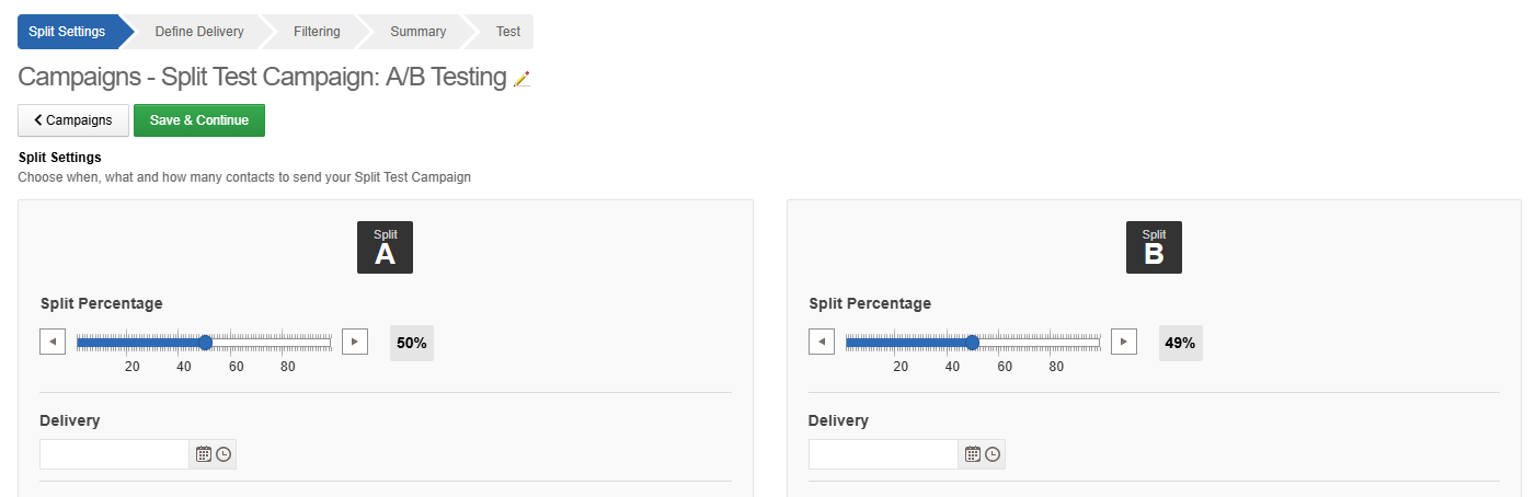
10. A/B Testing for Optimisation
A/B testing is indispensable for refining email performance. Experimenting with subject lines, CTAs, and layouts helps identify what resonates with your audience. For local authorities, this practice can ensure that critical information—like service changes or event announcements—is delivered effectively. Include tests for dark mode compatibility to ensure your emails perform consistently across varied user settings.
By adopting these trends and staying responsive to technological and societal shifts, local authorities can ensure their email communications remain impactful, inclusive, and aligned with community expectations.
You may also like these blogs

Best use of email for 2025
December 10th, 2024 - Harry Thomas
It was our second year judging the category of “Best use of email” at the UnAwards this year and we were delighted that along with 2024 being a...
Solutions
Email Marketing
Create email campaigns and newsletters and manage end-to-end subscription processes with forms and preferences.
Marketing Automation
Create sophisticated automated campaigns for email and SMS combined.
Digital Communication
The comprehensive solution to manage and automate your digital communication across email, SMS, websites and landing pages.
Email marketing healthcheck
We are confident that we can help you, which is why we offer a free healthcheck to identify potential issues with your current programme and free advice on things that could be done to improve it.