Blog
CATEGORY: email-marketing
Are you thinking mobile first?

As marketers the term ‘Mobile first’ is often thrown around. Mobile first, put simply refers to the process of designing an online experience for mobile before designing for desktop or any other devices. This term is becoming increasingly popular in the marketing, simply because mobile devices are being used more and more every day and for an increasing number of reasons.
Mobile first doesn’t mean you’re forgetting about desktop and other devices. It’s just in this day’s age, a mobile first approach is becoming more and more common. In fact, a mobile first design email will usually adapt well to desktop whereas a desktop to mobile design wont.
So why is a mobile first approach and optimisation email for mobile devices so important?
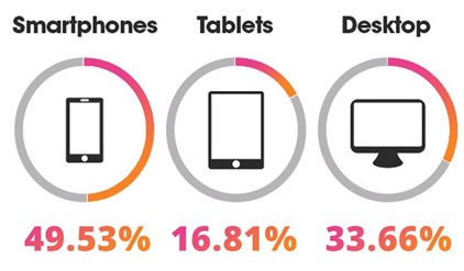
When designing and writing emails, mobile optimisation is essential. Why is this you ask? Over 60% of email campaigns are viewed on smartphones or tablets. As well as this, estimated statistics show that by the end of 2018, there was around 2.2 billion users who view emails on mobile devices.
It is a well-known fact that these days everything revolves around smartphones and new technology and viewing emails on these devices is one of its main uses, especially for those regularly on the move. So, with email still being a highly valuable method of communication, optimising your emails for mobile is very valuable and can increase your chances of engaging with your audience and driving your campaigns results.
As of recent years, being able to design an email which is suitable for smartphones has become very important if you want your audience to engage with your emails more. When designing emails, they should be designed in a way that is suitable for viewing on mobile and tablet devices. There are multiple tips to help achieve this which we will cover some of the key ones of in this article.
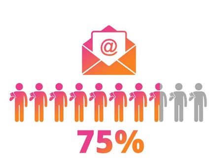
Studies show a massive 75% of smartphone owners regularly view emails on their phones.
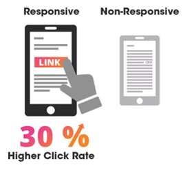
One of the main reasons consumers unsubscribe and delete emails is if they don’t display well on their mobile device. What does this mean? It means not making your emails mobile responsive can massively cost you and your email campaigns. On the other hand, companies that have mobile responsive emails see an increase in engagement and click through rate.
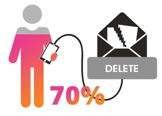
Research shows that 70% of consumers immediately delete an email that doesn’t render correctly on their mobile device.
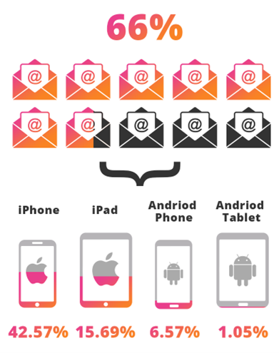
So, we know smartphones and tablets make up a very high percentage of where emails are opened but let’s dive into exactly what devices this percentage includes. As expected, Apple takes up a massive amount of this percentage.
Worried about making your emails mobile responsive?
Don’t worry e-shot offers several mobile functions to help with this and even has a mobile preview view for users to see what exactly their email will look like on a mobile device. We even offer email templates which are already set up to be mobile responsive and follow other best practices.
Top tips
Now let’s get into some key things to consider when making your email optimised for mobile devices. There are many ways to help optimise your email for mobile use and these are some of the main one’s for you to consider.

Subject lines
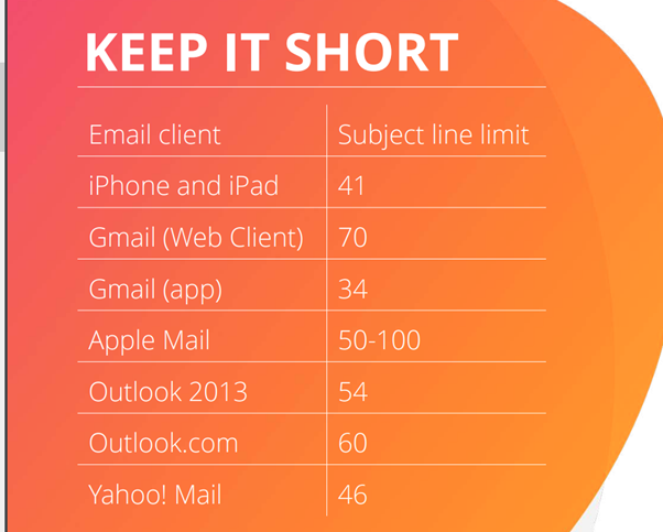
When emails are displayed on mobile devices, the screen size is significantly smaller than a desktop screen size. As a result, subject lines may not be fully displayed depending on how long they are. Data shows that most subject lines have around 35-50 characters. This is considerably long, and we would recommend for the best mobile optimisation you aim for no more than 30 characters if possible.
Often with subject lines less is more! And remember the subject line is the driving factor as to whether your email gets opened or not.
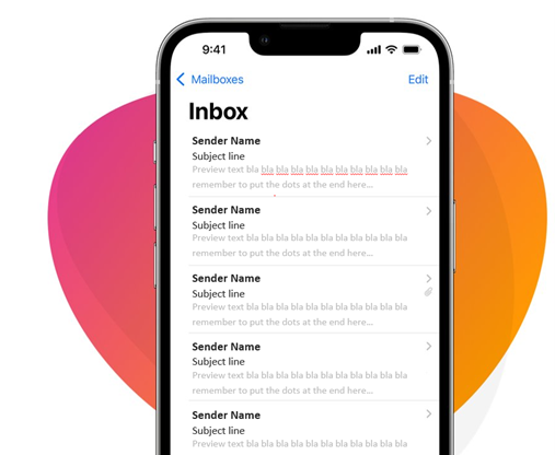
Preview text
The preview text of an email refers to the short summary text that is found below the subject line of an email when in the inbox. Every email needs some intriguing preview text. Preview text is taken from the first line of your email but platforms such as e-shot allow you to customise this. The subject line and preview text are your principal way to motivate your recipient to open an email and so both need to catch the readers eye and make them want to view what’s inside. For best results, we often suggest linking or connecting the subject line and preview text. Think of it like a newspaper headline and sub headline. This allows you to boost your emails message and means you are more than making the user aware of what’s in the email. On the other hand, it is important to also keep preview text short, informative, and easy to consume for the best results. Preview text should also be tailored to the audience and what preferences they are subscribed to.
Breathing/Clicking room
When designing emails, you want to make sure there is enough white space in between things so they are easy to view (this is also an important point when considering how accessible your email is – read our dedicated blog about accessibility in emails). Mobile screens are considerably smaller than desktops, so you need to ensure that it is just as easy for someone on mobile to read your content. Key features of your email can become compressed together, making the email look unpresentable and unreadable for the user. This is particularly important for buttons and anything that has a link attached, as you want to leave enough clicking and breathing room for users to be able to easily click on the CTA. To put this into some perspective, an MIT study shows the average size of an adult index finger translates to 45-57 pixels on a mobile device.

CTA
CTA standing for Call to Action is important to consider when designing emails for mobile devices. CTAs are often some of the most important parts of an email and are used to divert traffic elsewhere such as a company website. You want your CTAs to stand out, especially on mobile devices, it is often best to keep CTAs at the front and centre of an an email for easy viewing. Like previously discussed you also want to make sure there is enough clicking too around the link for the recipient to click. It is also a good idea to not have multiple links close together, so the user doesn’t accidently click on the wrong links.
Buttons
Buttons are a great way to really draw attention to a CTA. Buttons are a particularly useful and easy way to use CTAs on mobile devices as they can be eye-catching to the user, as well as this they are much easier for the user to click on in comparison to a link being embedded in some text. We’ve all been there when our fat thumbs can’t click on the right part of an email! Buttons are an easy way to solve that problem as well as making an email look better. With the use of buttons like always you want to make sure they are a suitable size and not to big as well as having enough white space to make it stand out as a key CTA.
Images
With emails the saying a “a picture paints a thousand words” is more than applicable. Use of images in emails is very important and you want to make sure you use and place them correctly. MDG Advertising stated 94% more total views on average are attracted by content containing compelling images than content without images.
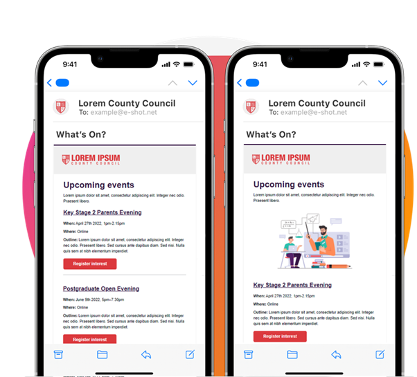
Image considerations for mobile:
Reduce image file sizes : Services such as FastStone Photo Resizer and JPEGmini and can reduce file size by as much as 80% without reducing the quality of your image.
Resize images by proportion of the screen
Content stacking
One thing you must pay attention to when optimising an email for mobile is the stacking of the content within the email.
The common problem with designing email for mobile is the singe column structure it follows. Due to the small screen, content within an email will stack on top of each other when displayed on a mobile device, so you must pay attention to this and make sure content stacks in the right order and one that makes sense and is easy for the user to view.
Keeping an email, the exact same on mobile as desktop could mean the content would be very tiny, squished and near impossible to view, which isn’t a good user experience!
The two forms of stacking are often referred to as ‘normal stacking’ and ‘reverse stacking’. Normal stacking takes the content on the left and places it on top and the content on the right and places it underneath. Reverse stacking is simply the opposite to normal stacking.
Testing
A tip that we at e-shot swear by is: Always test before sending. Even if you know you are following best practices and optimisation tips, you should still always test your emails before sending them out. e-shot easily allows you to do this both through the preview of your design or as a live send campaign test. Testing allows you to make sure no errors have been made and that everything looks as expected. It's an opportunity for you to see if anything needs changing such as images or text size as well as double checking your CTAs have working links.
As we are talking about mobile optimisation, it is always worth pulling out your phone to check what your email looks like on different devices.
Solutions
Email Marketing
Create email campaigns and newsletters and manage end-to-end subscription processes with forms and preferences.
Marketing Automation
Create sophisticated automated campaigns for email and SMS combined.
Digital Communication
The comprehensive solution to manage and automate your digital communication across email, SMS, websites and landing pages.
Email marketing healthcheck
We are confident that we can help you, which is why we offer a free healthcheck to identify potential issues with your current programme and free advice on things that could be done to improve it.