Blog
CATEGORY: email-marketing
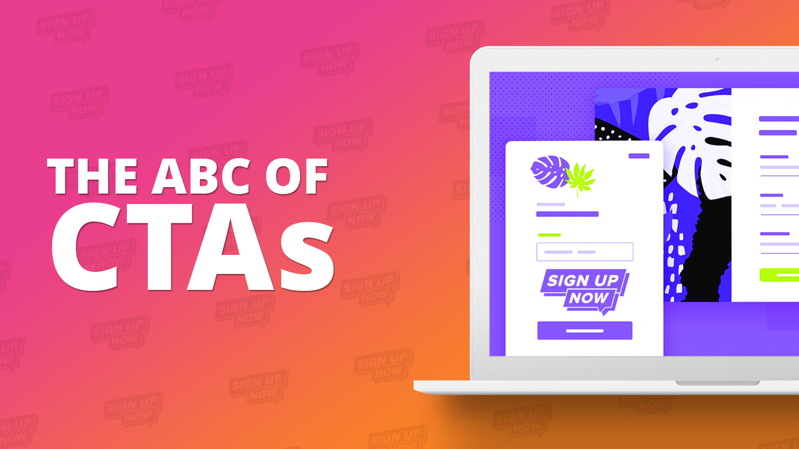
The ABC of CTAs
The call to action (or CTA) is one of the most important elements of an email. Whether you’re writing a newsletter, marketing email, fundraising request, or even an internal company email, a good CTA is what will motivate your readers to take action.
Calls to action help give our emails purpose. A good CTA will not only let the reader know what to do next. It will also create a sense of urgency, so they are more likely to take the desired action promptly.
There are multiple elements to a good and working CTA. Let’s start with its three main components:
Where it is (Placement)
What it looks like (Design)
What it says (Copy)
If you don’t have an enticing offer or reason for someone to click and take action, they’re not going to. In the same vein, if your call-to-action doesn’t stand out well enough or isn’t visually appealing, your audience might scroll right past it.
What makes a good CTA?
A good email CTA is clear, concise and describes the benefit that the reader will gain from clicking and taking action.
Keep it short and sweet
To be effective, an email should have one primary purpose.
Sometimes, you’ll need to include multiple CTAs for different actions, such as in a newsletter with links to different blog posts and resources. But generally, try to avoid overwhelming the reader with options.
How to make your CTA stand out
In a crowded inbox where people are short on time, it’s reasonable to assume a reader will skim your email, not read every word. So it’s important to think about how you’re going to make your CTA really stand out and attract those clicks.
This is why you want to put just as much emphasis on the design and overall look and feel of your calls-to-action as you do the text you place inside them.
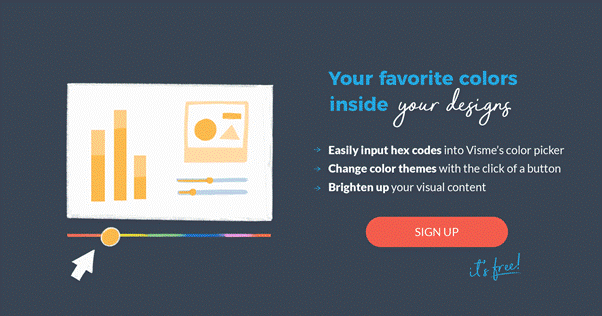
1. Colour matters.
Colour psychology is always important. Colours mean different things, but there are also colours that pop more than others and entice clicks more than others.
For example, when it comes to your call-to-action button, you want to be sure to use a colour that stands out. Your button needs to pop. (And the contrast of your button from both the background and the text within it is sufficient to ensure that it is accessible).

2. Test different button sizes/shapes.
Your call-to-action button text should be large enough to read easily, but not so large to be considered objectionable. Users often have a distaste—conscious or subconscious—for threateningly large lettering. So be sure your button text is big enough to draw attention, but don’t go overboard.
Sick of boring, square buttons? That doesn’t have to be the norm on every single call-to-action. Try something round or even rounded edges on your rectangle button.
You can also A/B test how well different buttons and graphic shapes perform. Maybe your audience actually likes a rectangular shape better. It all comes down to what is going to generate the most clicks and conversions.
3. Make sure your text is legible.
If someone can’t read your CTA, they have no idea what action you want them to take, rendering your mission useless.
Use large, legible text. This should typically be a clean and concise sans serif font, make sure there is sufficient colour contrast between the text and button colours and don't forget to check in both light and dark mode renderings in case the client changes the look that you are expecting to see.
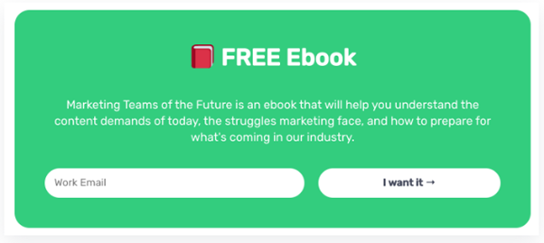
4. Add shapes, icons, and illustrations.
Create a visual design to go alongside your CTA. This will help grab your audience’s attention and draw them in. Another fun visual idea is to include a custom illustration or animated graphic, like in the example below, which is very on trend for 2023.
Something else that is very on trend for 2023 is the use of drop shadows around buttons to increase standout. But the drop shadow is a design element of its own, for example this patterned drop shadow.
For more about the latest email design trends take a look at our dedicated article.
5. Incorporate white space.
Using white space and margins around your design is essential to creating a clean and clutter-free design. Your CTA design shouldn’t go edge-to-edge on your canvas.
6. Watch your hierarchy.
Sometimes you’ll have other links, images, and buttons that aren’t your main call to action. Be sure those extras are not distracting.
The entire goal of your email is to get someone to click on your primary CTA button, so any other details need to take a back seat. Try using grey-scale buttons or matching colours for any secondary CTAs.
Your main call to action should be the biggest and brightest, and less is usually more when it comes to choices.
7. Follow a natural progression.
We read top to bottom and left to right, which creates logical places for CTA buttons: buttons placed toward the bottom or to the right of content tend to outperform other placements. This makes sense from a messaging standpoint, too.
For example, you’d want to put a Register now button in a spot where a user would find it after reading about your event—not before, as it would make no sense for users to register for something they know nothing about. Besides, you never want to make users backtrack to take action.
8. A/B test your designs.
A/B testing is important in many different marketing strategies, but especially when it comes to something that’s sole purpose is to elicit a response. And while you might think a certain design is going to perform best, your data could show otherwise.
This can help you to further optimize your call-to-action design and conversion rate, and ensure your CTAs are grabbing as much attention as possible. After all, there’s no 'perfect button' that works best all the time.
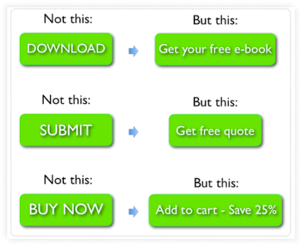
So, now you have been inspired by how your button should look and even where it should be placed - but what should it say? The best ones use precise, actionable language to attract attention. So lets look at the words that are more successful as CTAs.
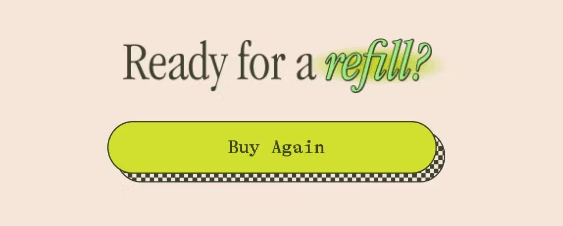
Don't just "submit" or "click here"
The CTA copy must clearly say what’s going to happen when users click on it. Whether it’s telling them that they’ll be getting a free 7-day trial, a free ebook, or updates on promos and offers – the CTA should clearly set users’ expectations.
Your call-to-action should have a clear meaning, even if a visitor has only skimmed your page. The words in your call-to-action should be representative of the action your visitors are taking.
1. Use action-oriented text.
Again, different action verbs work for different users on their user journey. CTAs such as “Learn more” or “Subscribe for free content” are a good fit for those in the awareness stage. You’d want to use phrases like “Get a free quote” for prospective customers in the interest and action stages.
Great awareness stage verbs:
Discover
Explore
Read about 'x'
Learn more
Show me
Continue (as long as this is supported sufficiently outside the button itself)
Subscribe
Great Interest/Action stage verbs:
Download my ' free x'
Sign Up
Book a call/demo/class/place
Start now
Try it
Create account
“Get Started” is probably the most popular call-to-action in the SaaS business space, and with good reason. It’s a highly actionable word that suggests your visitor will be able to move forward straight away when they click.
2. Using the first person.
Using pronouns or determiners like “me” or “my” can turn a call-to-action into a personal call-to-action, increasing a visitor’s emotional or cognitive connection with your button. For example, “Download Ebook” pales in comparison to “Download My Free Ebook!”.
Unbounce shared a study showing that changing button text from the second person (“Start your free trial”) to the first person (“Start my free trial”) resulted in a 90% increase in clicks. Those results are dependent on the product and personality, but numbers like those certainly warrant a test.
Try changing your CTA button to the first person: Reserve my spot, Get my freebie.
3. What's in it for me?
People want to know exactly what they’ll get in return for the action you’re asking them to take. Take advantage of this in your CTAs. As noted by Marketing Land, words like “Download” or “Buy now” don’t say anything about the value proposition.
To come up with a better CTA copy, ask yourself, “Why should the customer click here?” “What’s in it for them?”
4. Create urgency
Including a sense of urgency in your CTAs helps garner those high click-through rates. “Start now” call-to-action is a good example of a CTA phrase that uses the “now” modifier to create urgency.
Even just adding the word “now” builds some urgency.
Here are some examples of button text with extra urgency.
50% off today only
RSVP now—8 spots left
Shop now
5. Use social proof
Social proof is a big motivator for a lot of people – they want to do what others like them are doing.
It follows, then, that CTAs like “Join 123,456 brilliant marketers” can be very appealing.
They feel like they’re becoming part of something, part of a community, and feel like they’re missing out on something if they don’t covert.
CTAs are essential throughout digital marketing and many of the tips work just as well on a website, landing page or PPC ad campaign as they do within an email.
The key thing is to test, whether it is AB or Multivariate testing to see which design elements and text resonates best with your audience and with digital campaigns we can rely as much on the science as the art!
Solutions
Email Marketing
Create email campaigns and newsletters and manage end-to-end subscription processes with forms and preferences.
Marketing Automation
Create sophisticated automated campaigns for email and SMS combined.
Digital Communication
The comprehensive solution to manage and automate your digital communication across email, SMS, websites and landing pages.
Email marketing healthcheck
We are confident that we can help you, which is why we offer a free healthcheck to identify potential issues with your current programme and free advice on things that could be done to improve it.