Help articles
CATEGORY: Designs
Smart Editor: Optimising your design for mobile
You can use Mobile Formatting menu to configure displaying on mobiles. The settings of this section are only used to configure emails displaying on mobile devices.
You can set the font size for header, content, footer, info area, text size for block menu, headers H1, H2, H3, and their horizontal alignment.
You can also set text size for the buttons and enable their full width display and set email content margin.
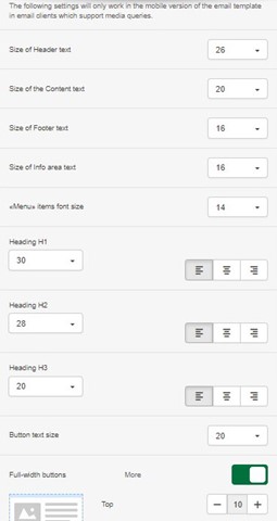
You can also add margins around the email for the mobile version.
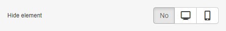
You can use options such as "Hide" element for mobile or desktop to choose which devices elements are display.
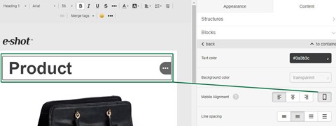
And align any block in the container for the mobile version. To do that, select the desired block, and click on the mobile icon in settings.
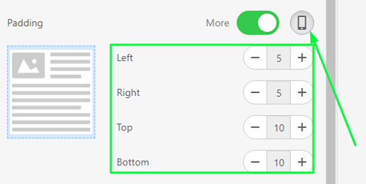
You can adjust the padding for any block/container/structure for mobile display, simply click on the mobile icon and set the padding.
The default values for the desktop version of emails/templates are used for mobile view. So if you are not going to use the same padding or text/image/button alignment, click on the "Mobile" icon and set the padding/alignment you require.
You can also disable the "Responsive structure" option for structures with 2 or more containers. In this case, you will see containers located in one row on mobile devices.
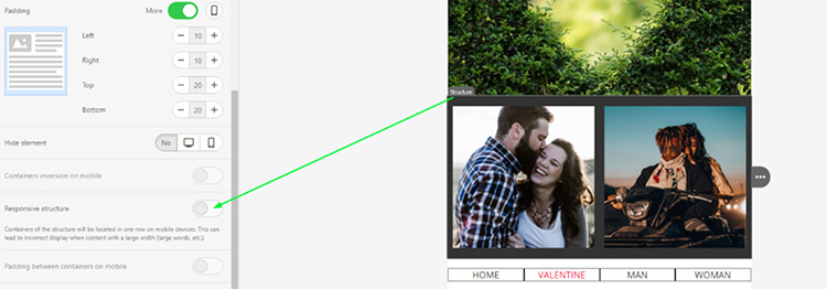
Please be careful with this option, if one of the containers contains a large non-responsive image or large font size for the text, the recipient may need to do a horizontal scroll, which is not a great user experience.
Don’t forget that you can preview your campaign in either desktop or mobile view so that you can preview the changes you have made and see the differences between the two renderings that you have implemented.
You may also like these articles
Designs
Message preview
September 2nd, 2019 - Sadie Burgess
In e-shot you are able to make use of our built-in preview function that helps to make email proofing faster and more reliable. This tool provides...
Solutions
Email Marketing
Create email campaigns and newsletters and manage end-to-end subscription processes with forms and preferences.
Marketing Automation
Create sophisticated automated campaigns for email and SMS combined.
Digital Communication
The comprehensive solution to manage and automate your digital communication across email, SMS, websites and landing pages.
Email marketing healthcheck
We are confident that we can help you, which is why we offer a free healthcheck to identify potential issues with your current programme and free advice on things that could be done to improve it.