Blog
CATEGORY: Accessibility
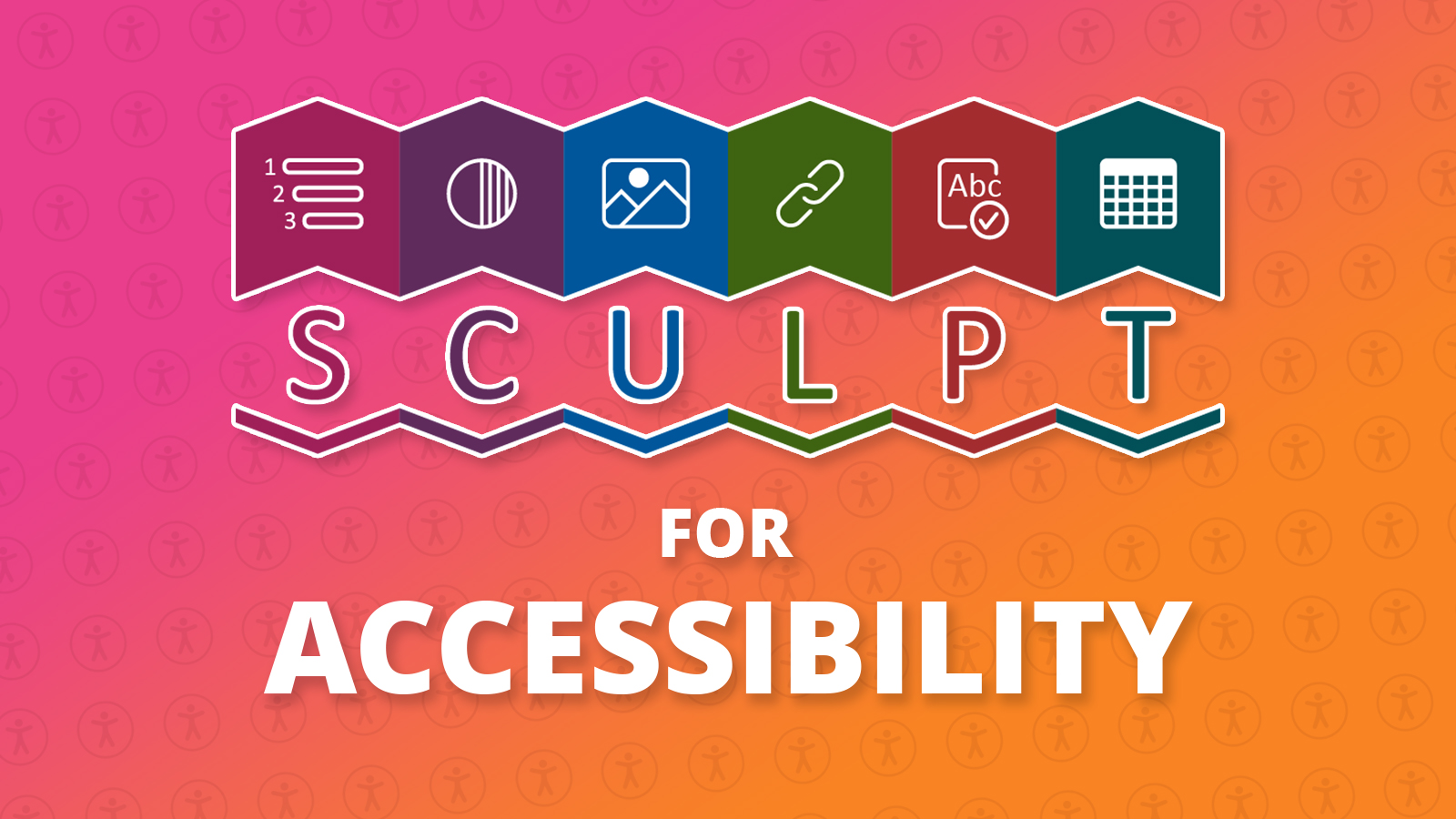
SCULPT for Accessibility
SCULPT is a bite-size guidance about accessibility. It came out of research conducted within Worcestershire County Council (WCC). It was created by Helen Wilson, Digital Designer at WCC.
SCULPT stands for:
Structure (use headings and styles)
Colour and contrast
Use of images
Links (hyperlinks)
Plain English
Tables
Guidelines for everyone?
The Public Sector Accessibility guidelines have highlighted a need to focus on accessible content creation.
Most advice about digital accessibility refers to the Web Accessibility Content Guidelines (WCAG), but many people find these guidelines confusing and too technical - reinforcing the perception of accessibility as a minefield best left to the technical team.
And whilst website designers and developers have WCAG guidelines enshrined in legislation, but what about those who create content that is used on websites and other aspects of the digital journey?
Keep it simple!
Sometimes small changes in a document can make a big difference. All that is needed is for the people creating to be aware of the simple things they could do to help.
For example most of us use Microsoft Word to create content, so learning about the built-in accessibility features would make a real difference to our newsletters, reports, handouts for students, instructions, guidance, policies and whatever else we share through our websites and emails...
Helen suggested “I wanted this to be something for people to remember, a ‘simple six’ for accessibility, a what to do guide. I wanted to also create an identity, a logo for people to see and remember, almost a brand to relate to and acronym to remember.”
SCULPT for Accessibility is a beginners guide to raise basic awareness and skills for accessibility across the wider workforce.
The SCULPT principles
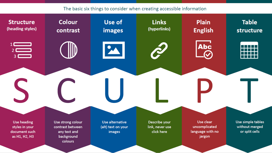
Structure (use of headings and styles)
Documents and web pages have visual cues to help users scan through content and identify key bits of information.
But imagine if:
you couldn't use a mouse and rely solely on a keyboard or assistive technology to read and navigate through it
you have sight issues and can’t see it properly
you couldn’t see it at all
Many people have these exact challenges, and they may use a screen reader to help them. Screen readers provide a list of the heading on a page to help a user find content quickly.
Headings, when used correctly, help both users who can and can't see a screen find information faster.
Useful links:
for accessible features in other Microsoft products please visit Microsoft accessibility video training
Colour and contrast
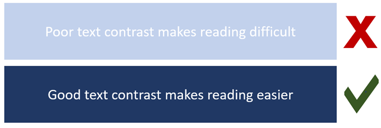
Considering colour and contrast isn't just about people being blind or having vision issues, it is important to everyone. Many people struggle to read yellow writing on a white background, imagine how much harder this would be if you had a visual impairment.
How to ensure good colour contrast
Use sufficient contrast for text and background colours:
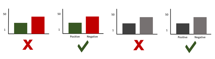
Ensure that colour is not the only means of conveying information
People who are blind, have low vision, or are colour-blind might miss out on the meaning conveyed by colours alone so use other distinguishing factors too, such as labels.
Imagine your content is being printed in black and white.
Without labelling the information, how would you know which was green for positive and red for negative in the black and white version?
You can use free colour contrast checkers online to ensure good colour contrast.
Useful links:
Use of images
There are four very simple things to consider when adding images to web pages, emails or documents.
use images that support the text
never use an image instead of text
use correct image sizes (on the web it is best to have images around 150kb)
use alt text on images
Alternative text
Alt text is used to provide an alternative description of the image for those people who are unable to view it. This may include people with visual impairments who use screen readers as well as people using text only browsers.
Never use an image instead of text
When text that is intended to be read is presented as an image, screen readers and other assistive technologies cannot read text that’s contained inside an image. They will instead read the alt text provided.
Best practice for accessibility is to write text as text. Users can often miss out on important information that’s conveyed through an image of text.
Useful links:
Links (hyperlinks)
Links work best when written in a descriptive way.
People who use screen readers sometimes might read the content of the page and then bring up a menu of the links separately to tab through and visit afterwards. A descriptive link will help the user understand where it is directing them.
Best practice
Do not use the full web address
A full website address written like this:
"https://www.worcestershire.gov.uk/digital-worcestershire/sculpt-accessibility"
Would be read out by a screen reader like this:
h t t p s colon forward slash forward slash w w w dot worcestershire dot gov dot uk forward slash digital hyphen worcestershire forward slash sculpt hyphen accessibility
If you had a long list of links that all read out in this way it would be very unhelpful and potentially not offer any clue as to where each link was going to.
Do not use repeated link titles such as 'click here' or 'find out more'
If you named all your links 'click here' or 'find out more' that is all a user would see or hear repeated in a menu of links.
Describe a link and where it is going
It is best to write the link as a description of where it is taking the user, for example: "Worcestershire County Council home page."
Useful links:
Plain English
Plain English is writing clearly with the reader in mind and with the right tone of voice.
Plain English means avoiding using hard to understand language, such as jargon, unexplained acronyms and long words.
Try to aim for an average reading age of 9-12. Plain English helps as many users as possible to understand your content.
Useful links:
Table structure
Tables really should be used for data and not used to facilitate page or document layouts.
When using tables to present data or information make sure you use a simple table structure with column headers, making sure that the tables don't contain split cells, merged cells, or nested tables (tables within tables).
Poorly formatted table make it very difficult for screen readers to navigate.
Just imagine if you could only use the arrow keys on your keyboard to tab through the table, could you logically tab up, down and left to right to get to every single cell logically and easily? If not, it's not accessible.
Useful links
You may also like these blogs
Accessibility Design Resources
Email accessibility checklist
May 16th, 2024 - Sadie Burgess
According to the World Health Organization, 2.2 billion people worldwide live with some form of visual impairment, with approximately 39 million...
Solutions
Email Marketing
Create email campaigns and newsletters and manage end-to-end subscription processes with forms and preferences.
Marketing Automation
Create sophisticated automated campaigns for email and SMS combined.
Digital Communication
The comprehensive solution to manage and automate your digital communication across email, SMS, websites and landing pages.
Email marketing healthcheck
We are confident that we can help you, which is why we offer a free healthcheck to identify potential issues with your current programme and free advice on things that could be done to improve it.