Help articles
CATEGORY: Media queries, short and simple
Media queries, short and simple

Media queries, short and simple
Media queries usually play a crucial role in enabling your HTML email to be mobile responsive. It is possible to make a mobile responsive email without them but, on the whole, they help out a great deal.
Be warned, though! Not all mobile email clients support media queries, so testing is important. Usually, a mobile client not supporting media queries (these are rare) will render the desktop version, in a small format that can be zoomed into, but this should be tested.
Let’s explore how a media query is built (I’ll be using one, that I find to be generally suitable for switching from desktop to mobile mode). It’s basically a piece of CSS (Cascading Style Sheets language) that dictates what certain elements should look like, once the width of the viewing space hits a certain pixel count (and anything less):
<style type="text/css">
@media only screen and (max-width: 570px) {
Regular CSS for your elements goes here
}
</style>
This media query says “if the screen width is anything up to 570 pixels wide, make the elements identified within this space, look like this”.
The above empty media query doesn’t really tell us anything, so let’s get some examples in:
<style type="text/css">
@media only screen and (max-width: 570px) {
.w50 {width:100%!important;}
.center {text-align:center!important;}
}
</style>
The below table structure will act on the media query when it’s invoked through a sufficiently narrow viewing space:
<table border="0" cellpadding="0"
cellspacing="0" width="100%"
role="presentation">
<tbody>
<tr>
<td>
<table align="left" width="49%" border="0" class="w50">
<tr>
<td class="center" valign="top" align="left" style="font-family:Arial, Helvetica, sans-serif; font-size:16px;">
Some nice text
</td>
</tr>
</table>
<table align="left" width="49%" border="0" class="w50">
<tr>
<td class="center" valign="top" align="right" style="font-family:Arial, Helvetica, sans-serif; font-size:16px;">
Specify your address here
</td>
</tr>
</table>
</td>
</tr>
</tbody>
</table>
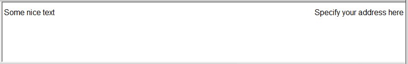
That’s great! But what does it mean? Let’s take a look:
Desktop:
Mobile:
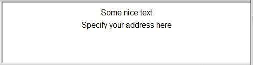
So, the style specification in the media query overrides the width specification in the table. The same goes for the text alignment in the table cell (TD).
Remember: test, test, test and test again!
Left-aligned tables total 98% in width to accommodate for the way Outlook on desktop behaves.
Solutions
e-shot ultimate
The complete solution to manage and automate your digital communication across email, SMS, websites and landing pages.
e-shot pro
Create sophisticated automated campaigns for email and SMS combined.
e-shot basic
Create email campaigns and newsletters and manage end-to-end subscription processes with forms and preferences.
Email marketing healthcheck
We are confident that we can help you, which is why we offer a free healthcheck to identify potential issues with your current programme and free advice on things that could be done to improve it.