Blog
CATEGORY: email-marketing
How will 2020 design trends influence your email creative?
The world of design continues to evolve and graphic design, along with technological advancement, continue to have and influence on email design. Trends that dominated designs in 2019 will still be popular in the coming year.
Current Trends
There are a number of trends that Really good emails identified in 2019 as set to continue well into 2020 – and they have built a series of boards with a variety of examples of each of these trends to inspire and enlighten as you plan your next project. We’ll continue to see vibrant colours, bold typography, and off-grid designs along with
But new trends in digital
design will make their way into the email design world over the coming
months. There are a number of graphic design trends
that will undoubtedly influence the aesthetics of the email genre. Let’s take a
look at some
Developing Trends
3D imagery
Combining animation with other content
New graphic design trends (more retro inspired design like Bauhaus/Swiss and use of abstractions)
Embracing Dark mode is set to really take off
3D Imagery
“The 3D trend reached its peak in 2019 and it certainly won’t fade away so quickly. Thanks to the opportunities of modern technology and software capabilities, in 2020, we will keep seeing more awesome 3D graphic design compositions. Moreover, in order to be more creative, designers will often combine it with other realities, such as photos and 2-dimensional objects.” GraphicMama
And whilst the 3D trend is prevalent in design it is only just starting to impact in the email space. 3D can bring depth and interest to your creative, and currently is a point of difference as it's uptake is limited. It is also a great new option to capitalise on as there are no significant rendering implications as whilst sophisticated the files are only image files.
What is more interesting, however, is how the 3D element is being used in email
– an example that Litmus highlighted is a Black Friday email from Designmodo.
Designmodo, offers a
range of web and email resources, bring a little 3D to the hero of this Black
Friday campaign, making their discount stand out:
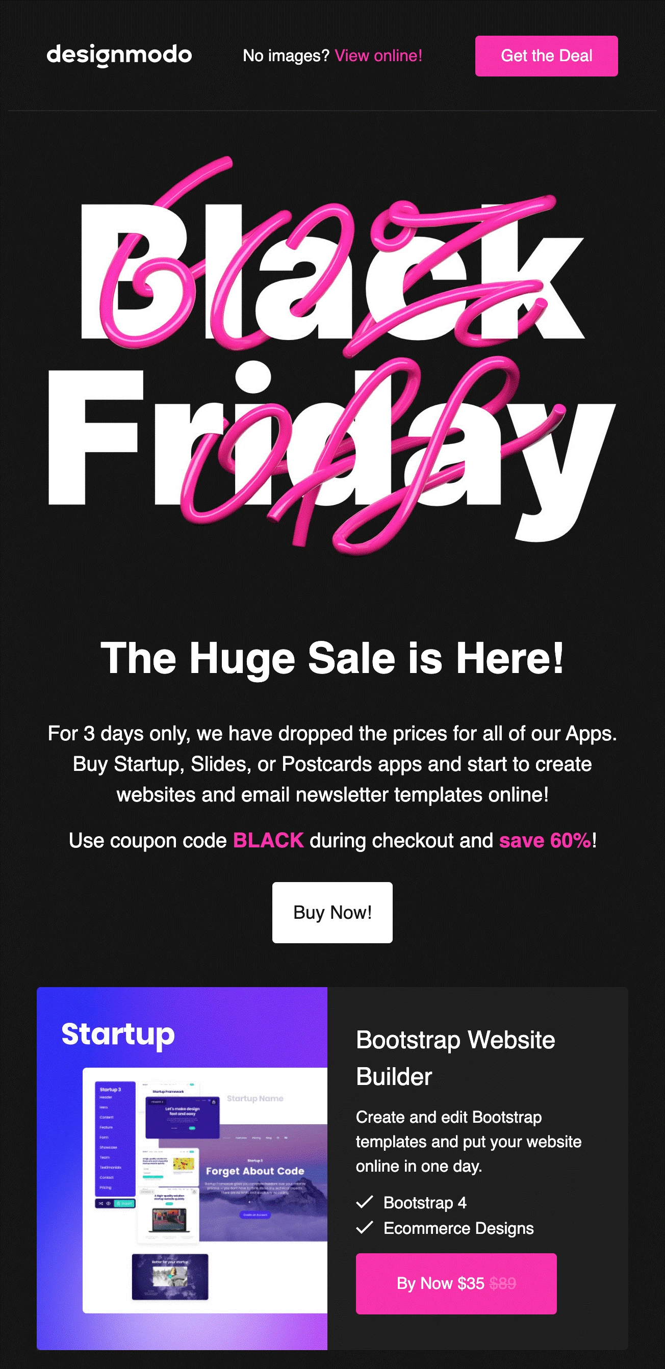
This is also a brilliant example of the second point – using animation to draw attention to CTAs, as well as using it to increase engagement as for those clients that will accept it the discount appears through an animation (although it looks equally good static as above).
Combining animation with other content
Animated
elements allow you to:
Catch the reader’s eye
Emphasize a promo or message
Drive subscribers to convert
Pulsing CTA buttons, image carousels,
highlighting text or looping motion, can all boost engagement and draw
attention to the key message. But these elements should be used sparingly to
ensure they maximise their impact. Simplicity
is key here, as if you go overboard with your animation or interactive elements
then the message can become confusing and overwhelming.
Here are some great examples of animationbeing used to really drive a point home:
If you have a variety of products or photos you want to highlight without the email feeling content-heavy, you can easily rotate photos using frame animation.
Frame animation can also be used to draw attention to your headline, by highlighting each word – just keep it simple.
When you design interactive
emails, keep in mind that some email clients won’t display them correctly. For
example, MS Outlook isn’t good with interactive elements. However, this problem
can be easily solved with segmentation — for example, you can create a separate
segment of Gmail users and send interactive emails only to them. Due to various
levels of support across inbox providers, animation in email marketing requires
thoughtful design to ensure deliverability. Using animated GIFs is the best wayto ensure your email renders well across the majority of email clients.
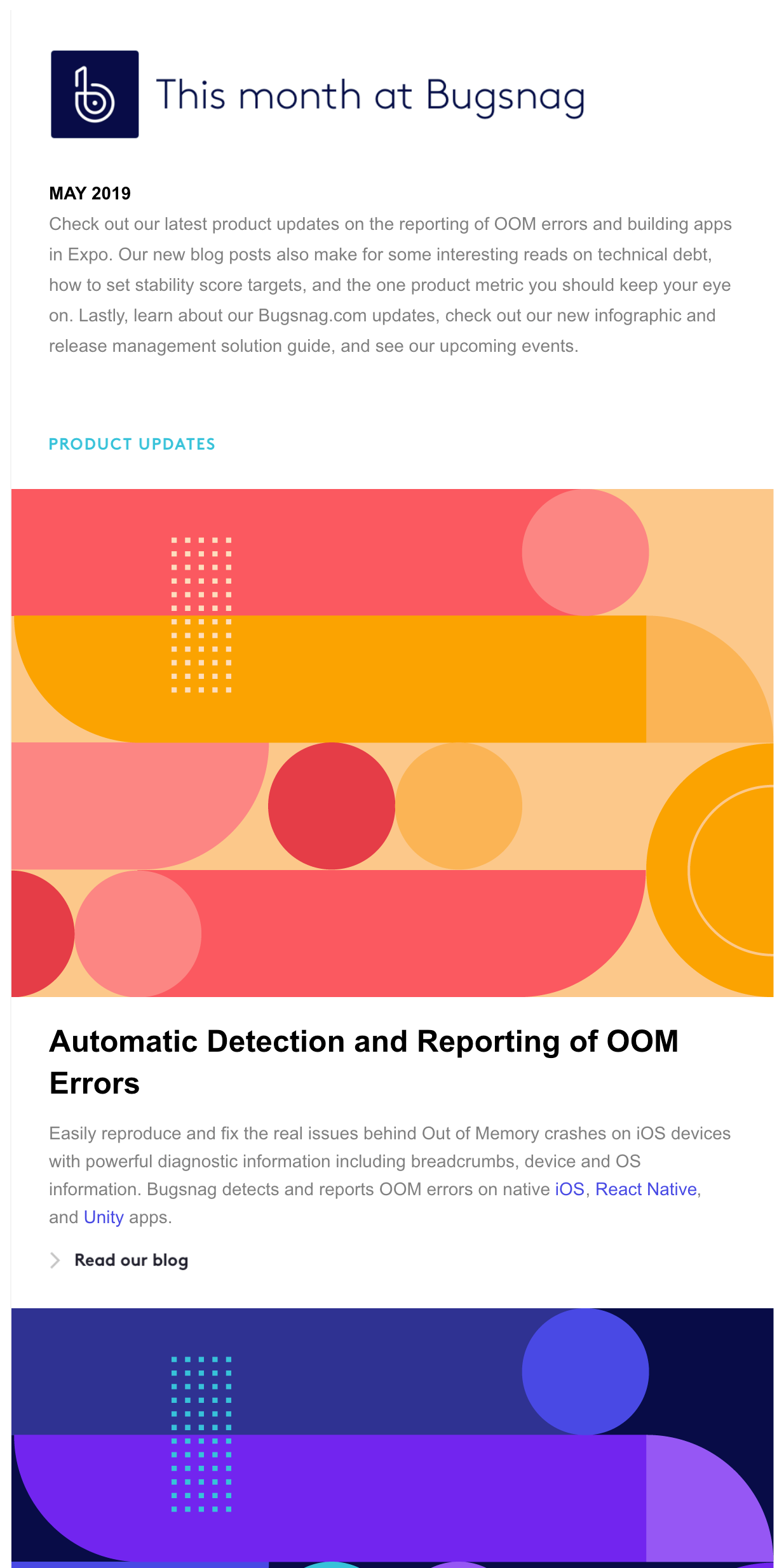
Retro design trends
With the Bauhaus movement celebrating its 100th anniversary in 2019, it’s no surprise that we’ve seen its linear lines, geometrical forms, and experimental compositions with broken grids regain popularity over the past months—and it will continue to influence email designs in 2020.
At the same time, Swiss Design is making a comeback, with its typical use of large sans serif typography (think Helvetica) becoming more popular than ever. Minimal is making a comeback, and the fonts are expected to be bold, simple and no-fuss, allowing the message to shine through without it being too much:
The result: Email designs with a hint of a retro feel that look fresh and modern—and simply beautiful—like this newsletter from Bugsnag.
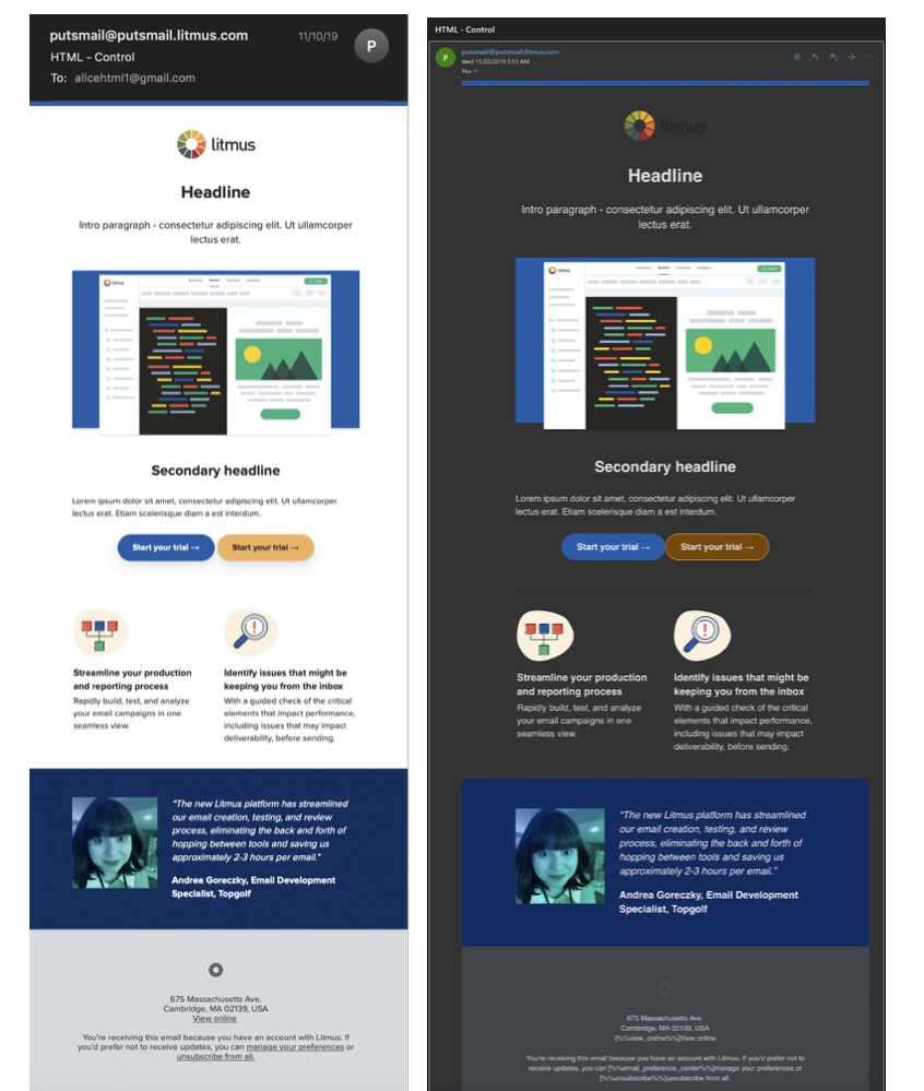
Embracing dark mode
Whilst dark mode has been available on many devices since the middle of 2019, with apps like Instagram and Gmail following suit in the last quarter, dark mode is ever increasing traction with consumers. Some argue the dark mode was to improved legibility others suggest it was purely a reaction to the increased minimalism in design. However there are some contexts where dark mode can be useful. According to Apple’s human interface guidelines, dark mode allows the “content to stand out while the surrounding UI recedes into the background.” dark mode works well when you want to encourage the reader to quickly scan stats and focus on key data points, like when looking at stocks, charts, or graphs. Likewise, a Salesforce study suggests that there may be some functional benefits when it comes to reading charts and graphics.
So using dark mode to highlight key points can be very effective, but while there’s plenty of advice out there for adequately optimizing your email content for the average inbox, email marketers need to start learning how to work with both dark and light optimization simultaneously, so that their audience can view these emails without issues.
Dark Mode is taking over the
inbox—and making sure emails look great in this reading environment is the new
big challenge for email marketers. Watch out for our dedicated article on dark mode email design for more guidance.
How will these design trends impact your email creative? Or will you be doing something completely different to stand out from the crowd. Design is an essential component in your overall email campaign, indeed 46.1% use visual design as the first indicator to judge if a company is credible - so once you have hooked them with your brilliant subject line, don't lose them with poor design.
You may also like these blogs

digital-marketing email-marketing
Is your vision into next year 2020?
November 26th, 2019 - Sadie Burgess
It’s that time again when thoughts turn to the coming year and it is time to start thinking ahead to the trends and developments that we can...

What is a GIF and why should you care
May 9th, 2019 - Sadie Burgess
We are all looking for ways to make our emails stand out from the crowd, something to set them apart from the other mails in the inbox. Those great...
Solutions
e-shot ultimate
The complete solution to manage and automate your digital communication across email, SMS, websites and landing pages.
e-shot pro
Create sophisticated automated campaigns for email and SMS combined.
e-shot basic
Create email campaigns and newsletters and manage end-to-end subscription processes with forms and preferences.
Email marketing healthcheck
We are confident that we can help you, which is why we offer a free healthcheck to identify potential issues with your current programme and free advice on things that could be done to improve it.